Chart Studies
A simple definition of a Study is that it is a graph of the results from a formula applied to the entire series of data elements in a chart. A study may also be called an indicator. In Sierra Chart they are called studies.
See the Technical Studies Reference documentation page for information on the available studies. In Sierra Chart, you can also create your own custom study by using the Spreadsheet Study or by using the Advanced Custom Study Interface and Language.
- Adding/Modifying Chart Studies
- Chart Studies Window
- Studies Available
- Studies to Graph
- Add
- Move Up / Move Down
- Settings
- Duplicate
- Remove (Analysis >> Studies)
- Save Studies as Study Collection
- Add Custom Study
- Study Settings Window
- Settings and Inputs Tab
- Based On - Basing a Study on Another Study
- Short Name
- Chart Region
- Value Format
- Scale
- ID
- Display As Main Price Graph
- Hide Study
- Draw Study Underneath Main Price Graph (in the same Chart Region)
- Protect With Password
- Spreadsheet Name / DLL File and Function Name
- Include in Study Summary
- Include in Spreadsheet
- Subgraphs Tab
- Subgraphs >> Graph Draw Type
- Subgraphs >> Color
- Subgraphs >> Draw Style
- Line (ACSIL: DRAWSTYLE_LINE)
- Bar (ACSIL: DRAWSTYLE_BAR)
- Point (ACSIL: DRAWSTYLE_POINT)
- Dash (ACSIL: DRAWSTYLE_DASH)
- Hidden (ACSIL: DRAWSTYLE_HIDDEN)
- Ignore (ACSIL: DRAWSTYLE_IGNORE)
- Stair Step (ACSIL: DRAWSTYLE_STAIR_STEP)
- Stair Step To Edge(ACSIL: DRAWSTYLE_STAIR_STEP_TO_EDGE)
- Square (ACSIL: DRAWSTYLE_SQUARE)
- Square Offset Left (ACSIL: DRAWSTYLE_SQUARE_OFFSET_LEFT)
- Square Offset Left for Candlestick (ACSIL: DRAWSTYLE_SQUARE_OFFSET_LEFT_FOR_CANDLESTICK)
- Star (ACSIL: DRAWSTYLE_STAR)
- Plus (ACSIL: DRAWSTYLE_PLUS)
- X (ACSIL: DRAWSTYLE_X)
- Arrow Up (ACSIL: DRAWSTYLE_ARROW_UP)
- Arrow Down (ACSIL: DRAWSTYLE_ARROW_DOWN)
- Arrow Left (ACSIL: DRAWSTYLE_ARROW_LEFT)
- Arrow Right (ACSIL: DRAWSTYLE_ARROW_RIGHT)
- Fill Top (ACSIL: DRAWSTYLE_FILL_TOP) and Fill Bottom (ACSIL: DRAWSTYLE_FILL_BOTTOM)
- Fill Rectangle Top (ACSIL: DRAWSTYLE_FILL_RECTANGLE_TOP) and Fill Rectangle Bottom (ACSIL: DRAWSTYLE_FILL_RECTANGLE_BOTTOM)
- Fill Rectangle To Zero (ACSIL: DRAWSTYLE_FILL_RECTANGLE_TO_ZERO)
- Left Side Tick Size Rectangle (ACSIL: DRAWSTYLE_LEFT_SIDE_TICK_SIZE_RECTANGLE) and Right Side Tick Size Rectangle (ACSIL: DRAWSTYLE_RIGHT_SIDE_TICK_SIZE_RECTANGLE)
- Color Bar (ACSIL: DRAWSTYLE_COLOR_BAR)
- Color Bar Hollow (ACSIL: DRAWSTYLE_COLOR_BAR_HOLLOW)
- Color Bar Candle Fill (ACSIL: DRAWSTYLE_COLOR_BAR_CANDLE_FILL)
- Box Top (ACSIL: DRAWSTYLE_BOX_TOP) and Box Bottom (ACSIL: DRAWSTYLE_BOX_BOTTOM)
- Box Top Center (ACSIL: DRAWSTYLE_BOX_TOP_CENTER) and Box Bottom Center (ACSIL: DRAWSTYLE_BOX_BOTTOM_CENTER)
- Custom Text (ACSIL: DRAWSTYLE_CUSTOM_TEXT)
- Text With Background (ACSIL: DRAWSTYLE_TEXT_WITH_BACKGROUND)
- Bar Top (ACSIL: DRAWSTYLE_BAR_TOP) and Bar Bottom (ACSIL: DRAWSTYLE_BAR_BOTTOM)
- Transparent Bar Top (ACSIL: DRAWSTYLE_TRANSPARENT_BAR_TOP) and Transparent Bar Bottom (ACSIL: DRAWSTYLE_TRANSPARENT_BAR_BOTTOM)
- Line - Skip Zeros (ACSIL: DRAWSTYLE_LINE_SKIP_ZEROS)
- Transparent Fill Top (ACSIL: DRAWSTYLE_TRANSPARENT_FILL_TOP) and Transparent Fill Bottom (ACSIL: DRAWSTYLE_TRANSPARENT_FILL_BOTTOM)
- Text (ACSIL: DRAWSTYLE_TEXT)
- Point On Low (ACSIL: DRAWSTYLE_POINT_ON_LOW)
- Point On High (ACSIL: DRAWSTYLE_POINT_ON_HIGH)
- Triangle Up (ACSIL: DRAWSTYLE_TRIANGLE_UP)
- Triangle Down (ACSIL: DRAWSTYLE_TRIANGLE_DOWN)
- Triangle Left (ACSIL: DRAWSTYLE_TRIANGLE_LEFT)
- Triangle Right (ACSIL: DRAWSTYLE_TRIANGLE_RIGHT)
- Triangle Right Offset(ACSIL: DRAWSTYLE_TRIANGLE_RIGHT_OFFSET)
- Triangle Right Offset for Candlestick (ACSIL: DRAWSTYLE_TRIANGLE_RIGHT_OFFSET_FOR_CANDLESTICK)
- Transparent Fill Rectangle Top (ACSIL: DRAWSTYLE_TRANSPARENT_FILL_RECTANGLE_TOP) and Transparent Fill Rectangle Bottom (ACSIL: DRAWSTYLE_TRANSPARENT_FILL_RECTANGLE_BOTTOM)
- Transparent Fill Rectangle To Zero (ACSIL: DRAWSTYLE_TRANSPARENT_FILL_RECTANGLE_TO_ZERO)
- Transparent Text (ACSIL: DRAWSTYLE_TRANSPARENT_TEXT)
- Background (ACSIL: DRAWSTYLE_BACKGROUND)
- Diamond (ACSIL: DRAWSTYLE_DIAMOND)
- Fill to Zero (ACSIL: DRAWSTYLE_FILL_TO_ZERO)
- Transparent Fill to Zero (ACSIL: DRAWSTYLE_TRANSPARENT_FILL_TO_ZERO)
- Left Price Bar Dash (ACSIL: DRAWSTYLE_LEFT_PRICE_BAR_DASH)
- Right Price Bar Dash (ACSIL: DRAWSTYLE_RIGHT_PRICE_BAR_DASH)
- Candlestick Body Open (ACSIL: DRAWSTYLE_CANDLESTICK_BODY_OPEN) and Candlestick Body Close (ACSIL: DRAWSTYLE_CANDLESTICK_BODY_CLOSE)
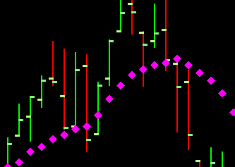
- Value on High (ACSIL: DRAWSTYLE_VALUE_ON_HIGH)
- Value on Low (ACSIL: DRAWSTYLE_VALUE_ON_LOW)
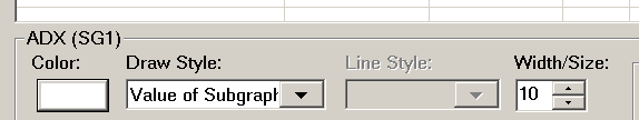
- Value of Subgraph (ACSIL: DRAWSTYLE_VALUE_OF_SUBGRAPH)
- Custom Value At Y (ACSIL: DRAWSTYLE_CUSTOM_VALUE_AT_Y)
- Custom Value At Y with Border (ACSIL: DRAWSTYLE_CUSTOM_VALUE_AT_Y_WITH_BORDER)
- Custom Value at Y Left Aligned (ACSIL: DRAWSTYLE_CUSTOM_VALUE_AT_Y_LEFT_ALIGNED)
- Custom Value at Y Right Aligned (ACSIL: DRAWSTYLE_CUSTOM_VALUE_AT_Y_RIGHT_ALIGNED)
- Transparent Custom Value at Y Left Aligned (ACSIL: DRAWSTYLE_TRANSPARENT_CUSTOM_VALUE_AT_Y_LEFT_ALIGNED)
- Transparent Custom Value at Y Right Aligned (ACSIL: DRAWSTYLE_TRANSPARENT_CUSTOM_VALUE_AT_Y_RIGHT_ALIGNED)
- Point Right Offset (ACSIL: DRAWSTYLE_POINT_RIGHT_OFFSET)
- Point Left Offset (ACSIL: DRAWSTYLE_POINT_LEFT_OFFSET)
- Subgraph Name and Value Labels Only (ACSIL: DRAWSTYLE_SUBGRAPH_NAME_AND_VALUE_LABELS_ONLY)
- Line at Last Bar to Edge (ACSIL: DRAWSTYLE_LINE_AT_LAST_BAR_TO_EDGE)
- Horizontal Profile (ACSIL: DRAWSTYLE_HORIZONTAL_PROFILE)
- Horizontal Profile Hollow (ACSIL: DRAWSTYLE_HORIZONTAL_PROFILE_HOLLOW)
- Left Offset Box Top (ACSIL: DRAWSTYLE_LEFT_OFFSET_BOX_TOP) and Left Offset Box Bottom (ACSIL: DRAWSTYLE_LEFT_OFFSET_BOX_BOTTOM)
- Right Offset Box Top (ACSIL: DRAWSTYLE_RIGHT_OFFSET_BOX_TOP) and Right Offset Box Bottom (ACSIL: DRAWSTYLE_RIGHT_OFFSET_BOX_BOTTOM)
- Right Offset Box Top for Candlestick (ACSIL: DRAWSTYLE_RIGHT_OFFSET_BOX_TOP_FOR_CANDLESTICK) and Right Offset Box Bottom for Candlestick (ACSIL: DRAWSTYLE_RIGHT_OFFSET_BOX_BOTTOM_FOR_CANDLESTICK)
- Square Offset Right (ACSIL: DRAWSTYLE_SQUARE_OFFSET_RIGHT)
- Square Offset Right for Candlestick (ACSIL: DRAWSTYLE_SQUARE_OFFSET_RIGHT_FOR_CANDLESTICK)
- Transparent Circle (ACSIL: DRAWSTYLE_TRANSPARENT_CIRCLE)
- Circle Hollow (ACSIL: DRAWSTYLE_CIRCLE_HOLLOW)
- Transparent Circle Variable Size (ACSIL: DRAWSTYLE_TRANSPARENT_CIRCLE_VARIABLE_SIZE)
- Circle Hollow Variable Size (ACSIL: DRAWSTYLE_CIRCLE_HOLLOW_VARIABLE_SIZE)
- Point Variable Size (ACSIL: DRAWSTYLE_POINT_VARIABLE_SIZE)
- Point Variable Size With Border (ACSIL: DRAWSTYLE_POINT_VARIABLE_SIZE_WITH_BORDER)
- Line Extend To Edge (ACSIL: DRAWSTYLE_LINE_EXTEND_TO_EDGE)
- Background Transparent (ACSIL: DRAWSTYLE_BACKGROUND_TRANSPARENT)
- Transparent Custom Value At Y (ACSIL: DRAWSTYLE_TRANSPARENT_CUSTOM_VALUE_AT_Y)
- Left Offset Box Top for Candlestick (ACSIL: DRAWSTYLE_LEFT_OFFSET_BOX_TOP_FOR_CANDLESTICK) and Left Offset Box Bottom for Candlestick (ACSIL: DRAWSTYLE_LEFT_OFFSET_BOX_BOTTOM_FOR_CANDLESTICK)
- Color Background At Price (ACSIL: DRAWSTYLE_COLOR_BACKGROUND_AT_PRICE)
- Line at Last Bar to Left Side (ACSIL: DRAWSTYLE_LINE_AT_LAST_BAR_TO_LEFT_SIDE)
- Line at Last Bar Left to Right (ACSIL: DRAWSTYLE_LINE_AT_LAST_BAR_LEFT_TO_RIGHT)
- Line From End of Chart Left to Right (ACSIL: DRAWSTYLE_LINE_FROM_END_OF_CHART_LEFT_TO_RIGHT)
- Left Side Tick Size Rectangle (ACSIL: DRAWSTYLE_LEFT_SIDE_TICK_SIZE_RECTANGLE)
- Right Side Tick Size Rectangle (ACSIL: DRAWSTYLE_RIGHT_SIDE_TICK_SIZE_RECTANGLE)
- Transparent Square Offset Left for Candlestick (ACSIL: DRAWSTYLE_TRANSPARENT_SQUARE_OFFSET_LEFT_FOR_CANDLESTICK)
- Transparent Square Offset Right for Candlestick (ACSIL: DRAWSTYLE_TRANSPARENT_SQUARE_OFFSET_RIGHT_FOR_CANDLESTICK)
- Transparent Left Side Tick Size Rectangle (ACSIL: DRAWSTYLE_TRANSPARENT_LEFT_SIDE_TICK_SIZE_RECTANGLE)
- Transparent Right Side Tick Size Rectangle (ACSIL: DRAWSTYLE_TRANSPARENT_RIGHT_SIDE_TICK_SIZE_RECTANGLE)
- Transparent Circle Variable Size With Border (ACSIL: DRAWSTYLE_TRANSPARENT_CIRCLE_VARIABLE_SIZE_WITH_BORDER)
- Notes about Top and Bottom Draw Style Pairs
- Filling the Area Between Two Study Subgraphs
- Filling the Area Between Two Study Subgraphs within Different Studies
- Subgraphs >> Line Style
- Subgraphs >> Line Width/Size
- Subgraphs >> Auto Coloring
- Subgraphs >> Label
- Subgraphs >> Text To Draw
- Subgraphs >> Displacement
- Subgraphs >> Name and Value Labels
- Subgraphs >> Display Name and Value in Chart Values Windows
- Subgraphs >> Display Name and Value in Region Data Line
- Subgraphs >> Include in Summary
- Subgraphs >> Include In Spreadsheet
- Subgraphs >> Use Transparent Label Background
- Subgraphs >> Display Study Subgraphs Name and Value - Global
- Subgraphs >> Display Study Name
- Subgraphs >> Display Input Values
- Subgraphs >> Always Show Name and Value Labels When Enabled
- Subgraphs >> Use Common Displacement
- Subgraphs >> Resolve Full Names for Reference Inputs
- Subgraphs >> Display Values When Hidden
- Subgraphs >> Use Chart Graphics Settings for Subgraph Colors
- Transparency Level for Fill Styles
- Alerts Tab (Opens a new page)
- Settings and Inputs Tab
- Quick Access to Study Settings
- Changing Study Inputs Directly from Chart
- Hiding and Showing Study Directly from Chart
- Using Custom Default Study Settings
- Password Protecting Studies
- Preventing Study From Compressing Main Price Graph
- Adjusting Study Settings Input Regions
- Displaying a Study with Both Bars and Bounding Line
- Avoiding Vertical Joining Line for Study Subgraphs
- Adding a Horizontal Line to an Existing Study
- Hiding a Study Subgraph within a Study
- Study Display Order
- Study Calculation Precedence And Related Issues
- Basing Study Calculations on Set Time Range in Chart
- References to Other Charts and Tagging
- Resolving Study Not Visible Issue
- Using Transparency
- Resolving Study Differences
- First Bar Study is Visible At
- Adding Multiple Instances of the Same Study
- Reducing Processing Time for Studies
- Using the Basic Arithmetic Studies (Opens a new page)
- Study Collections (Opens a new page)
- Alert Conditions and Scanning (Opens a new page)
Adding/Modifying Chart Studies
- Open or go to an already opened chart for which you want to add studies to, or modify the studies of.
- Select Analysis >> Studies on the menu or press the F6 key on your keyboard to display the Chart Studies window.
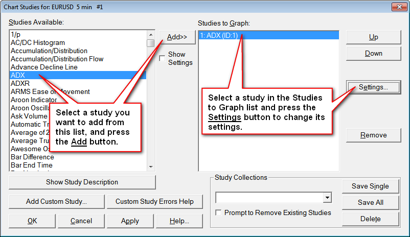
- To Add a study, select a study in the Studies Available list box (see image to the right) and then press the Add button. Any number studies can be added to a chart and even the same study can be added more than once to the chart. For example, you can add 2 Moving Averages to the chart, each with a different Length input.
Advanced Custom Studies from DLL files (these are studies developed by other developers) can be added by pressing the Add Custom Study button. The names of all the Advanced Custom Study files will be listed on the Studies list on the Add Study window. Press the + sign to the left of the Advanced Custom Study file name to list all of the available Custom Studies within that file.
To add a study to the chart, select the custom study from the list and press the Add button. For additional information, refer to the How to Use an Advanced Custom Study page. - To Modify the settings for a study, select the study in the Studies to Graph list box and press on the Settings button to open the Study Settings Window for the study.
On the Study Settings window you will see two tabs. The Settings and Inputs tab is for setting the study's Inputs and various other settings. The Subgraphs tab sets various appearance settings for the study's subgraphs. This includes the Draw Style and Color of each Subgraph. Each line in a study is called a Subgraph. Although, not all Subgraphs are continuous lines. For example, the Bar Draw Style are individual vertical lines at each chart column that are all related to each other and are considered one subgraph. - When you are done, press the OK button on the Study Settings window for a study, if it is open. If not, go onto the next step.
- Press the OK button on the Chart Studies window to apply your studies and changes to the chart.
- To quickly modify the settings for a study after it is on the chart, refer to the Quick Access to Study Settings section.
Note: For the Subgraphs in a study graph to be visible, you need to have enough data in the chart. For example, a Moving Average study with a Length of 10 needs at least 10 bars of historical data in the chart. If there are only 10 bars in the chart, then you will only see one point of data in the Moving Average graph.
Chart Studies Window
Open the Chart Studies window by selecting Analysis >> Studies on the menu.
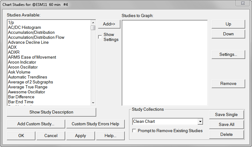
Studies Available
Lists all available studies that can be applied to a chart.
Studies To Graph
Lists the studies that will or are currently applied to the chart.
After each study name, is the calculation time in milliseconds during the last full recalculation of the study. Refer to the image below for an example of this.
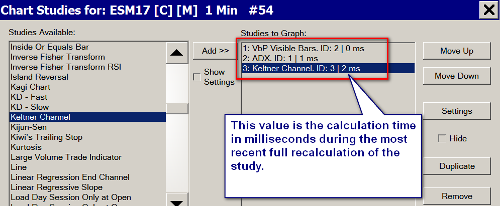
This time represents the full calculation time. Not the calculation time, at each chart update. At a chart update, a study may not take any calculation time because it has nothing to do. Therefore, it takes no time.
Each study has a unique ID assigned to it (ID: ). It is unique and cannot be changed after it is assigned. When a study is duplicated, it will receive a new ID.
Add
Adds the selected study in the Studies Available list box to the Studies To Graph list box. If you wish to add the same study more than once, then press the Add button twice.
Move Up / Move Down
Moves the selected study in the Studies To Graph list box, up or down one level.
This is useful for adjusting the study display order on the chart, study calculation order, or the display order of studies on a Spreadsheet when using one of the Spreadsheet studies.
If you are using one of the Spreadsheet studies, then the order studies that will be displayed on the Spreadsheet is the same as this list.
Settings
The Settings command button displays the Study Settings Window for the selected study in the Studies To Graph list box.
To select a study, just select its name in the Studies to Graph list box with your Pointer. A study must be first added to the Studies to Graph list box before you can adjust the settings for it.
Duplicate
The Duplicate command button duplicates the selected study in the Studies To Graph list box and creates an exact copy of it using the same settings.
Another way to apply a study to a chart is to save that single study as a Study Collection that contains a single study. Refer to Study Collections. Make sure to enable the option to Prompt to Remove Existing Studies.
Remove (Analysis >> Studies)
Removes the selected study in the Studies To Graph list box. Press OK or Apply to actually remove the study from the chart.
Save Studies as Study Collection
These controls are for Study Collections:
- Save Single
- Save All
- Delete Study Collections List
- Delete
- Prompt to Remove Existing Studies
Refer to the Study Collections page for complete documentation.
Add Custom Study
Opens the Add Custom Study window. This window allows you to add Advanced Custom Studies to the chart. The Advanced Custom Studies are contained within DLL (dynamic Link Library) files. These DLL study files need to be located in the Sierra Chart Data Files Folder. You can find this folder by selecting Global Settings >> General Settings on the menu.
OK
Saves all changes, closes the window and calculates the studies.
Cancel
Cancels all changes and closes the window.
Apply
Saves all changes and calculates the study while keeping the window open.
Help
Displays this page.
Study Settings Window
The Study Settings window is for entering and adjusting the settings for a study on the chart. To open the Study Settings window for a study, follow these steps:
- Open the Chart Studies window if it is not already open by selecting Analysis >> Studies on the menu.
- Add the study to the Studies To Graph list on the Chart Studies window, if it is not already added.
- Highlight the study in the Studies To Graph list by selecting it with your pointer.
- Press the Settings button on the Chart Studies window to display Study Settings window.
- For more details, refer to Adding/Modifying Studies.
OK
The OK button saves all changes and closes the window.
Cancel
The Cancel button cancels all changes and closes the window.
Help
The Help button displays this page.
Settings and Inputs tab
To access the Settings and Inputs tab for a study, refer to Adding/Modifying Chart Studies. Refer to the image below.
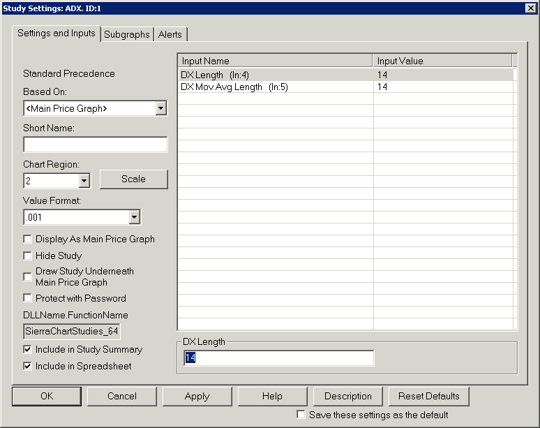
Settings and Inputs Tab >> Inputs
The Inputs list box displays the input settings for the study which control various parameters of the study. To adjust an Input, click on its name in the list and enter or select the new value in the control box or boxes just below the list.
Settings and Inputs Tab >> Based On - Basing a Study on Another Study
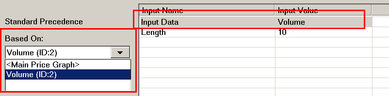
The Based On setting on the Settings and Inputs tab of the Study Settings window supports basing a study another study. For example, you could apply the Moving Average study to a Volume study. Follow the instructions below.
Not all studies support being based on other studies. For example, studies that rely on two or more of the Open, High, Low, or Close values of chart bars usually cannot be based on other studies unless they have Input Data inputs to control what specific Subgraphs to reference in the study they are based on.
- Open the Study Settings window for a study by following the instructions in the Adding/Modifying Chart Studies section on this page.
- Select the Inputs and Settings tab.
- Select from the Based On list the study to base the study that the Study Settings window is open for, on. Only studies which are already added to the Studies to Graph list on the Chart Studies window will be listed. It is necessary for a study to be in that list in order to base a study on it. If you want to base a study on the main price graph, then select <Main Price Graph>.
- When you base a study on another study, then the inputs named Input Data will list the Subgraphs of the study you are basing your study on. After setting Based On, you will need to choose the appropriate Subgraph listed in these Input Data inputs. This is especially important when basing a study that normally is based on the main price graph and refers to Open, High, Low, or Close/Last values from that main price graph. Those Input Data Inputs now need to refer to the appropriate Study Subgraphs it is based on.
- Adjust the Chart Region setting for the study to the same region as the study you are basing it on, if you want it displayed in that same region.
- If you wish to hide the study that you Based your study on because it is not in itself useful for you to view, then enable the Hide Study setting on the Study Settings window for that study.
- Press OK.
Settings and Inputs Tab >> Short Name
Use the Short Name setting to give a study a short or custom name to display as an alternative to the default study name in the Region Data Line for the chart region where the study is located on the chart and to display in the Chart Values windows. This name is also displayed on a Spreadsheet where the study is outputted to when using one of the Spreadsheet studies. In the case of the Spreadsheet studies, the original name is displayed in (). Example: YourCustomShortName (Moving Average-Simple).
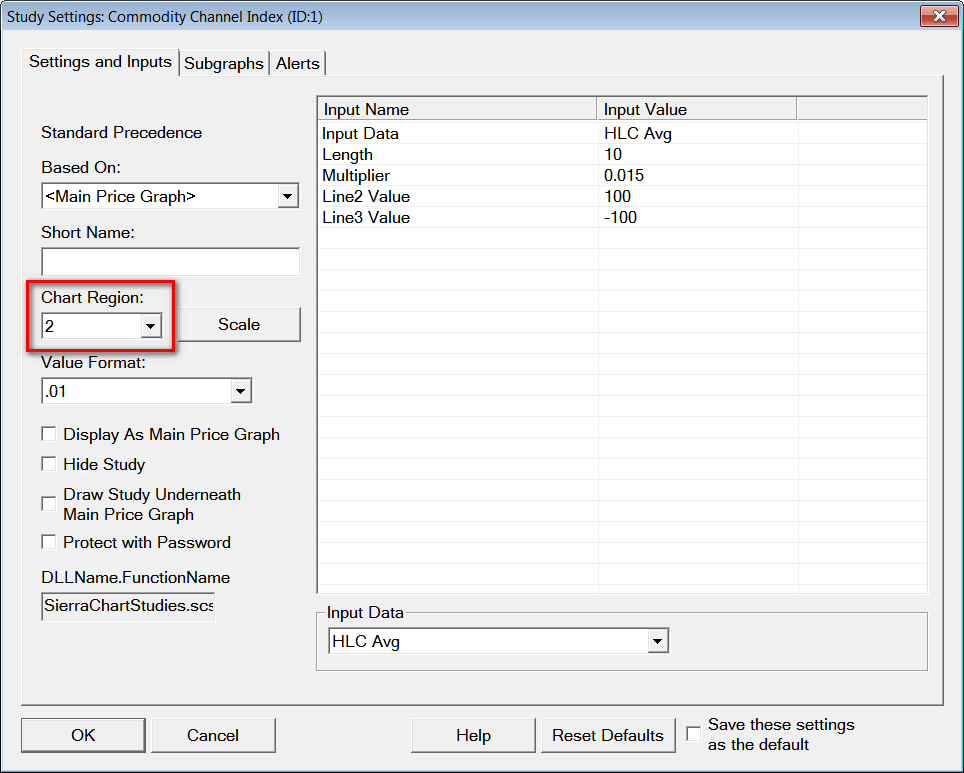
Settings and Inputs Tab >> Chart Region
Use Chart Region drop-down list to set the region to display the study in.
There are 12 regions in a chart. Region 1 is at the top of the chart window. It is where the main price graph is located. Regions 2 through 12 are below the main price graph.
Regions 2 through 12 are only displayed if a study is set to display in one of them.
Note that it is not possible to display some Subgraphs of a study in one chart region and some in another chart region. It is the entire study that gets displayed in the selected chart region. If you want to display some Subgraphs in one region and some in another, then you can either use multiple studies, or use the Study Subgraph Reference study to accomplish this.
If you notice a blank Chart Region, then make sure there are no other studies using a Chart Region below that Chart Region. There could also be studies which are hidden in that Chart Region. Refer to Hide Study.
When studies are added or removed, and this changes the used Chart Regions within the chart, the height percentages of these regions are reset to default. One way to avoid this is to use preconfigured Study Collections which also save the region heights. Therefore, you can switch between different configurations saved exactly as you want just by selecting the particulars previously saved Study Collection.
-
Overlaying Studies in the Same Chart Region on a Chart
Follow the instructions below to overlay 2 studies in the same Chart Region on the chart.
- Select Analysis >> Studies from the Sierra Chart menu.
- Add the 2 studies to the chart. For instructions, refer to Adding/Modifying Chart Studies.
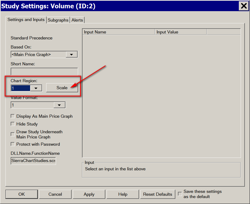
- Select one of the studies and press the Settings button to display the Study Settings window for the study.
- Set the Chart Region box to 2 or whatever chart region you want it displayed in.
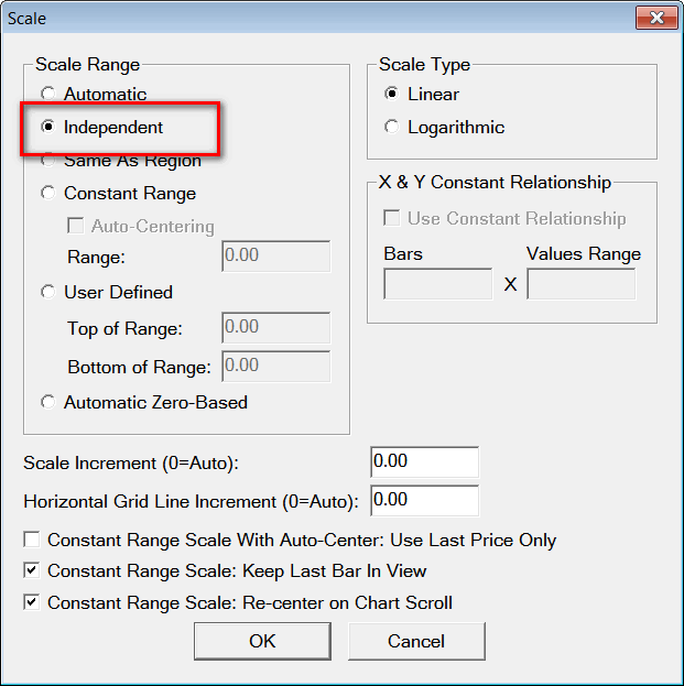
- Note: If you are overlaying studies that have significantly different scales, then it is necessary to set the Scale Range of one of them to an Independent scale. On the Study Settings window for the current study, which is already open, press the Scale button and set the Scale Range to Independent.
- Press OK.
- Repeat steps 2 and 3 above for the other study. Make sure this other study is set to the same Chart Region as the other study you require in the same Chart Region.
- Press OK and OK again.
- If you require to see the scale for each of these studies, then select Chart >> Chart Settings >> Scale. Enable the Use Left Side Scale option.
-
Overlaying a Study on the Main Price Graph
It is also supported to set the Chart Region to 1 to overlay the study on the main chart graph.
- For example, if you want to overlay a stochastic on the main price graph, then Select Analysis >> Studies from the Sierra Chart menu.
- Add the study that you want to overlay in Chart Region 1 by selecting it from the Studies Available list.
- Press the Add button.
- Press the Settings button to display the study settings.
- Set the Chart Region box to 1.
- On the Study Settings window, which is already open for the study, press the Scale button and set the Scale Range to Independent. Refer to the image below.
- Press OK and OK again.
-
Displaying a Scale on the Left Side for the Overlay Study
In the case where there is more than one study in the same Chart Region or you have a study displayed in the main price graph region, you may want to see the scale for the second and additional studies. To do this you will need to enable the Left Side Scale.
Settings and Inputs Tab >> Value Format
Use this drop-down list to set the value format for displaying the study values. Selecting a Fractional value or the Decimal locations will display the data to that nearest amount of the value selected.
The remaining options will set the values for the study as defined below:
- Time: The study values will be displayed as times. This is only valid if the study values actually contain valid time values.
- Inherited: The Price Display Format set in Chart >> Chart Settings for the chart is used.
- Large Integer with Suffix: Study values that are inherently integers (Volume, for example) are displayed as the actual value from -9,999 to +9,999. From -999,999 to +999,999 the numbers are divided by 1,000 and displayed with one decimal place and the suffix of K (for example, 489,200 would display as 489.2K). Beyond this range the numbers are divided by 1,000,000 and displayed with one decimal place and the suffix of M (for example, 3,268,423 would display as 3.3M).
- Percent: The study values are displayed as Percentages. Therefore, the underlying value is multiplied by 100 and is displayed with a %.
Settings and Inputs Tab >> Scale
The Scale button displays the Scale window. The controls in that window set the scale used for the study graph. For complete information about the Scale window, see the Scale Window documentation page.
Settings and Inputs Tab > > ID
This option allows for the Study ID to be changed. Enter the new Study ID number in this field and then select Apply or OK to update the Study ID.
If the Study ID does not change after selecting Apply or OK then this is due to another study already using that ID. To make this kind of change, the other study must first be changed to a different ID.
Settings and Inputs Tab >> Display As Main Price Graph
This option is in the Settings and Inputs tab for a study.
When Display As Main Price Graph is enabled, the study will be displayed as the main price graph in the chart. It will replace the underlying price bars the study is based on and the study itself will become the new underlying data for any other studies on the chart.
For example, if you enable this option on the Difference (Bars) study, then any other studies added to the chart will be based directly on this study and not the original main price graph.
This option can also be used on the Spreadsheet Study study. Using this feature with the Spreadsheet Study can be a very useful feature and will let you do many things with Sierra Chart.
This option is also very useful to create currency cross rates by using it with the Ratio study and two currency charts.
If using this option with the Spreadsheet Study, then the K column is the Open price, the L column is the High, the M column is Low, and the N column is the Close.
Settings and Inputs Tab >> Hide Study
When this option is enabled the study will be hidden from the chart. The Study name and the name and value for Subgraphs will also not be displayed in the Chart Values Windows.
The usefulness of this option is that you can effectively disable the display of a study without actually removing it from the chart, and still retain its settings and calculation functionality.
If you still want the study to appear on the Study Summary window when it is hidden, then make sure that Settings >> Include Hidden Studies is enabled on the Study Summary Window.
Hidden studies are still calculated. They have to be calculated.
Settings and Inputs Tab >> Draw Study Underneath Main Price Graph (in the same Chart Region)
To access the Draw Study Underneath Main Price Graph setting, open the Study Settings window for the study. Select the Settings and Inputs tab.
When the Draw Study Underneath Main Price Graph option is enabled and the study is displayed in Chart Region 1, then the study will be drawn directly underneath the main price graph bars instead of above them.
This setting has no effect on a chart which uses the TPO Profile Chart study. Instead the display order can be controlled by reordering the studies in the Studies to Graph . Refer to Study Display Order .
Settings and Inputs Tab >> Protect with Password
For complete documentation for this feature, refer to Password Protecting Studies.
Settings and Inputs Tab >> Spreadsheet Name / DLL File and Function Name
For Spreadsheet studies, this is the name of the Spreadsheet file the study is associated with. In this case do not specify a file extension. For complete documentation, refer to Using the Spreadsheet Study.
For Advanced Custom Studies, this is the DLL (Dynamic Link Library) file name and function name for the study in the format: [DLL File Name].[External Function Name] (Example: MyDll.MyFunction).
In the case of Advanced Custom Studies, 64 bit DLLs will normally have the extension _64. However, this _64 extension may not be displayed in this box if the study was previously added in the 32-bit version of Sierra Chart. Although when using the 64-bit version of Sierra Chart the 64-bit DLL will be loaded and the _64 will be appended if needed in the background but not displayed.
Settings and Inputs Tab >> Include in Study Summary
When this option is enabled the study Subgraphs will be included in the Study Summary window assuming that at least one of the study Subgraphs has Subgraphs >> Include in Study Summary enabled as well. For more information, refer to Study Summary.
Settings and Inputs Tab >> Include in Spreadsheet
When this option is enabled, the Subgraphs of the study will be outputted to the Spreadsheet Sheet used by one of the Spreadsheet Studies if the chart has one of the Spreadsheet Studies on it.
For more information, refer to Using the Spreadsheet Study.
Note that each study Subgraph also has a control as to whether it will be outputted to the Spreadsheet. Both of these settings must be enabled for the Subgraph data to be outputted to the Spreadsheet Sheet.
For more information on this Subgraph option, refer to Subgraphs Tab >> Include in Spreadsheet.
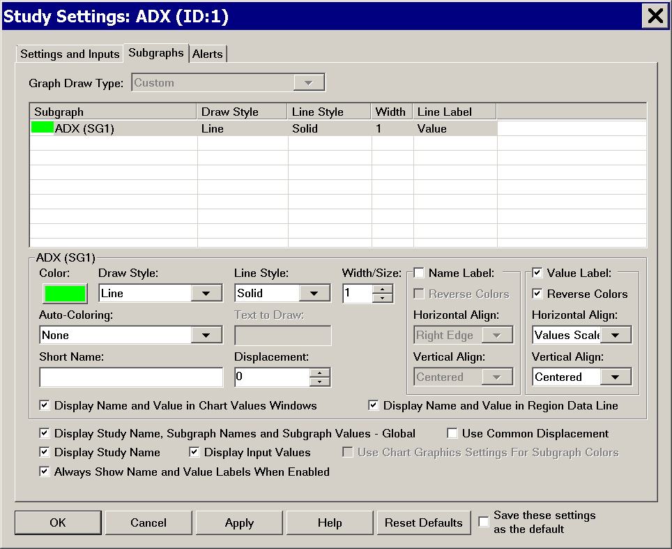
Subgraphs Tab
The Subgraphs tab of the Study Settings window contains the individual settings for each of the Subgraphs that are used in the study, as well as settings that affect all Subgraphs.
The list box at the top of the tab lists the Subgraphs which are used by the study.
Select the individual Subgraph in that list you want to change the settings for and use the controls below to change its settings.
Each line in a study is called a Subgraph. Although not all subgraphs are continuous lines. For example, the Bar Draw Style are individual vertical lines at each chart column that are all related to each other and are considered one Subgraph.
Follow these steps to go to the Subgraphs tab for a study:
- Select Analysis >> Studies on the menu.
- Select a study in the Studies to Graph list. If you have not already added the study to the chart, then Add it.
- Press the Settings button.
- Select the Subgraphs tab on the Study Settings window.
- Select the individual Subgraph in the list at the top of the Subgraphs tab that want to change the settings for and use the controls below to change its settings.
Subgraphs Tab >> Graph Draw Type
For studies that use a price graph type of drawing, support the Graph Draw Type setting. This setting lets you choose between various Graph Draw Types which include Open, High, Low, Close (OHLC) bars and Candlestick bars.
Choose the Graph Draw Type that you require.
For studies that support the Graph Draw Type setting, the individual Subgraphs only support a Draw Style of Visible or Ignore.
This control is disabled for Studies which do not support a price graph type of drawing.
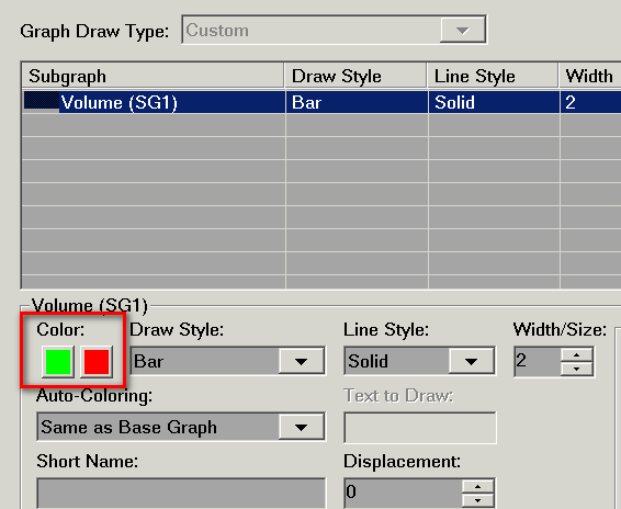
Subgraphs Tab >> Color
The Subgraph Color settings specify the color of the study Subgraph.
If the study Subgraph supports two colors, then there will be a second color button. In this case, the first button is considered the Primary color and the second button is considered the Secondary color.
There are various ways in which a Study Subgraph will use the colors. The standard method is that there is a single color button and the entire study Subgraph is colored the selected color. When there are two color buttons, then a Subgraph can be colored both of those colors depending upon various conditions.
A second color button will appear and follow predefined coloring rules when the Subgraph >> Auto-Coloring setting is set to other than None.
Subgraphs Tab >> Draw Style
The Draw Style drop-down list allows you to select the Draw Style for a study Subgraph.
- To set the Draw Style for a Subgraph, open the Study Settings window for a study.
- Select the Subgraphs tab.
- In the list of Subgraphs, select the particular Subgraph you want to modify the Draw Style for.
- If you want to hide a Subgraph, set the Draw Style for it to Hidden or Ignore. Refer to the descriptions below for these.
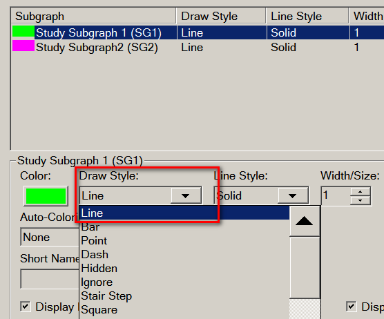
The available Draw Style types are listed below.
References to ACSIL in parentheses indicate the actual constant value that can be assigned to sc.Subgraph[].DrawStyle. ACSIL = Advanced Custom Study Interface and Language.
Line (ACSIL: DRAWSTYLE_LINE)
A standard continuous line Draw Style.
In the case where a Subgraph is not drawing zero values and contains zero values, and you do not want a nonzero value at a particular chart column to connect with another nonzero value at a further forward chart column where there are zeros in between these columns and not drawn, when using this Draw Style, then use the Line - Skip Zeros Draw Style instead.
Bar (ACSIL: DRAWSTYLE_BAR)
A bar style where a line is drawn from 0 to the value of the Subgraph within a chart column.
Point (ACSIL: DRAWSTYLE_POINT)
This draw style is a point or circle.
Dash (ACSIL: DRAWSTYLE_DASH)
This draw style is a dash which is the width of the chart bars.
For additional information on how the Line Style appears when using the Dash Draw Style, refer to Line Style.
Hidden (ACSIL: DRAWSTYLE_HIDDEN)
This style does not draw the Subgraph. However, the Subgraph data still is included in the displayed Scale Range.
The study Subgraph is still calculated in the background. Although study calculations are always very efficient. There is a slightly reduced CPU load because the Subgraph is not drawn.
Ignore (ACSIL: DRAWSTYLE_IGNORE)
This style does not draw the Subgraph. The Subgraph data is not included in the displayed scale range and therefore has no effect on the scale for the Chart Region.
The study Subgraph is still calculated in the background. Although study calculations are always very efficient. There is a slightly reduced CPU load because the Subgraph is not drawn.
Stair Step (ACSIL: DRAWSTYLE_STAIR_STEP)
A stairstep draw style.
Stair Step To Edge(ACSIL: DRAWSTYLE_STAIR_STEP_TO_EDGE)
A stairstep draw style that extends to the edge of the Values Scale on the right side of the chart.
Square (ACSIL: DRAWSTYLE_SQUARE)
A single independent square draw style.
Square Offset Left (ACSIL: DRAWSTYLE_SQUARE_OFFSET_LEFT)
An independent square draw style. The square's right side is offset to the left of the bar.
Square Offset Left for Candlestick (ACSIL: DRAWSTYLE_SQUARE_OFFSET_LEFT_FOR_CANDLESTICK)
An independent square draw style. The square's right side is offset to the left of the bar based on the candlestick body width.
Star (ACSIL: DRAWSTYLE_STAR)
An independent star draw style.
Plus (ACSIL: DRAWSTYLE_PLUS)
An independent plus sign draw style.
X (ACSIL: DRAWSTYLE_X)
An independent 'X' draw style.
Arrow Up (ACSIL: DRAWSTYLE_ARROW_UP)
An independent up arrow draw style.
Arrow Down (ACSIL: DRAWSTYLE_ARROW_DOWN)
An independent down arrow draw style.
Arrow Left (ACSIL: DRAWSTYLE_ARROW_LEFT)
An independent left arrow draw style.
Arrow Right (ACSIL: DRAWSTYLE_ARROW_RIGHT)
An independent right arrow draw style.
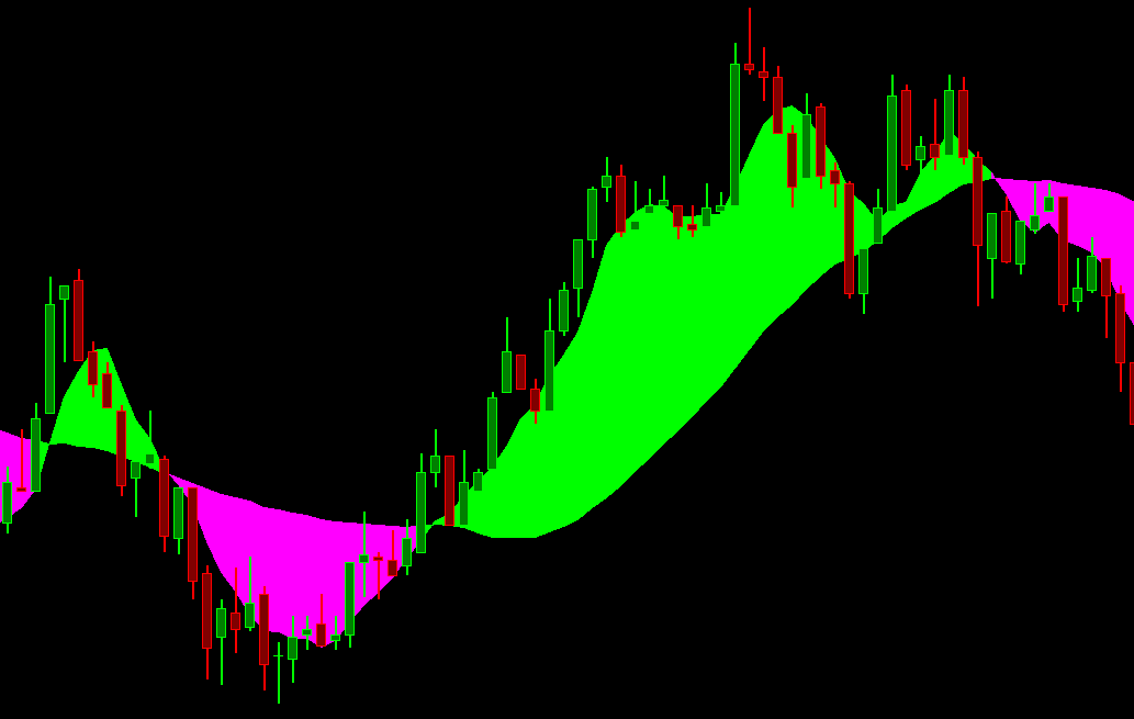
Fill Top (ACSIL: DRAWSTYLE_FILL_TOP) and Fill Bottom (ACSIL: DRAWSTYLE_FILL_BOTTOM)
These two Draw Styles are used in combination to fill the area between the two Subgraphs that are set to them. With these draw styles, the edges of the fill area are smooth. For more information, refer to the Notes about Top and Bottom Draw Style Pairs.
Fill Rectangle Top (ACSIL: DRAWSTYLE_FILL_RECTANGLE_TOP) and Fill Rectangle Bottom (ACSIL: DRAWSTYLE_FILL_RECTANGLE_BOTTOM)
These two Draw Styles are used in combination to fill the area between the two Subgraphs that are set to them. With these draw styles, the edges of the fill area are rectangular. For more information, refer to the Notes about Top and Bottom Draw Style Pairs.
Fill Rectangle To Zero (ACSIL: DRAWSTYLE_FILL_RECTANGLE_TO_ZERO)
Left Side Tick Size Rectangle (ACSIL: DRAWSTYLE_LEFT_SIDE_TICK_SIZE_RECTANGLE) and Right Side Tick Size Rectangle (ACSIL: DRAWSTYLE_RIGHT_SIDE_TICK_SIZE_RECTANGLE)
Color Bar (ACSIL: DRAWSTYLE_COLOR_BAR)
This Draw Style is used to fully color price graph bars with the color/colors the Subgraph is set to, or the color set in the corresponding ACSIL sc.Subgraph[].DataColor[] array element if it is used by the study.
A price graph bar is a type specified by the Graph Draw Type setting other than the Custom setting.
A price graph bar will be colored when a Subgraph data element for the corresponding bar is nonzero.
When using this Draw Style for coloring price bars for studies in Chart Regions other than 1, it is necessary that the study using this Draw Style is set to draw after the study that it is coloring. Refer to Study Display Order.
Color Bar Hollow (ACSIL: DRAWSTYLE_COLOR_BAR_HOLLOW)
This Draw Style is used to color the main price graph bars with the color/colors the Subgraph is set to, or the color set in the corresponding ACSIL sc.Subgraph[].DataColor[] array element if it is used by the study. A bar will be colored when a Subgraph data element for the corresponding bar is nonzero. In order for the chart bars to be colored, you need to set the study to display in Chart Region 1.
The area drawn will be the outline of the candlestick when used with a candlestick graph. With an OHLC bar graph, the entire OHLC bar will be colored.
Color Bar Candle Fill (ACSIL: DRAWSTYLE_COLOR_BAR_CANDLE_FILL)
This Draw Style is used to color the main price graph bars with the color/colors the Subgraph is set to, or the color set in the corresponding ACSIL sc.Subgraph[].DataColor[] array element if it is used by the study. A bar will be colored when a Subgraph data element for the corresponding bar is nonzero. In order for the chart bars to be colored, you need to set the study to display in Chart Region 1.
The area drawn is only the body of the candlestick when used with a candlestick graph. With an OHLC bar graph, the entire OHLC bar will be colored.
Box Top (ACSIL: DRAWSTYLE_BOX_TOP) and Box Bottom (ACSIL: DRAWSTYLE_BOX_BOTTOM)
These two Draw Styles are used in combination to create boxes which are the width of the spacing between the chart bars.
For more information, refer to the Notes about Top and Bottom Draw Style Pairs.
Box Top Center (ACSIL: DRAWSTYLE_BOX_TOP_CENTER) and Box Bottom Center (ACSIL: DRAWSTYLE_BOX_BOTTOM_CENTER)
These two Draw Styles are used in combination to create boxes which are the width of the spacing between the chart bars.
The box is positioned around the center of the chart bar.
For more information, refer to the Notes about Top and Bottom Draw Style Pairs.
Custom Text (ACSIL: DRAWSTYLE_CUSTOM_TEXT)
Custom Text is not an actual Draw Style. It is used only for the setting of the Color and Size of custom drawn text that a study performs. The study will set itself to use this Draw Style. This is not a Draw Style that you would ever manually set. However, you will use it to set the Color and Size of custom drawn text from the study.
Text With Background (ACSIL: DRAWSTYLE_TEXT_WITH_BACKGROUND)
Bar Top (ACSIL: DRAWSTYLE_BAR_TOP) and Bar Bottom (ACSIL: DRAWSTYLE_BAR_BOTTOM)
These two Draw Styles are used in combination to draw a vertical line/bar from the top Subgraph to the bottom Subgraph. The width of this line/bar is controlled by the Width setting of the first Subgraph used in this pair. For more information, refer to the Notes about Top and Bottom Draw Style Pairs.
Transparent Bar Top (ACSIL: DRAWSTYLE_TRANSPARENT_BAR_TOP) and Transparent Bar Bottom (ACSIL: DRAWSTYLE_TRANSPARENT_BAR_BOTTOM)
These two Draw Styles are used in combination to draw a vertical line/bar from the top Subgraph to the bottom Subgraph. The width of this line/bar is controlled by the Width setting of the first Subgraph used in this pair. For more information, refer to the Notes about Top and Bottom Draw Style Pairs.
This line/bar is drawn with transparency. The level of transparency is controlled through the Transparency Level for Fill Styles setting on the Subgraphs tab.
Line - Skip Zeros (ACSIL: DRAWSTYLE_LINE_SKIP_ZEROS)
This Draw Style draws a continuous line. Where there are zero values in the Subgraph, no line will be drawn at those points. Here is an example: There are the Subgraph values for the chart columns of 1, 2, 3, 0, 4. There will be no line drawn between 3 and 4. This differs from using sc.Subgraph[].DrawZeros = FALSE in ACSIL, by not actually drawing a line where there are 0 values. Whereas when setting DrawnZeros to FALSE, a line would actually be drawn from 3 to 4 but it would not go down to the 0 value. That is the key difference.
Transparent Fill Top (ACSIL: DRAWSTYLE_TRANSPARENT_FILL_TOP) and Transparent Fill Bottom (ACSIL: DRAWSTYLE_TRANSPARENT_FILL_BOTTOM)
These 2 Draw Styles used in combination to fill the area between the two Subgraphs that are set to them. The filled area is transparent and the edges of the filled area are smooth. For more information, refer to the Notes about Top and Bottom Draw Style Pairs.
The level of transparency is controlled through the Transparency Level for Fill Styles setting on the Subgraphs tab.
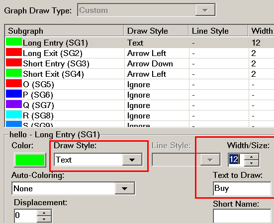
Text (ACSIL: DRAWSTYLE_TEXT)
This Draw Style will display the specified text at each chart bar/column at the level of the Subgraph value for that bar/column. The actual text is specified with the Text to Draw setting for the Subgraph. To clearly see the text, be certain to set the Width/Size setting for the Subgraph to a large enough value. For example, use 12. Refer to the image.
Point On Low (ACSIL: DRAWSTYLE_POINT_ON_LOW)
This is a special type of draw style where when a Subgraph value at a column in the chart is nonzero, then a circle or point will be drawn on the low of the corresponding bar.
Point On High (ACSIL: DRAWSTYLE_POINT_ON_HIGH)
This is a special type of draw style where when a Subgraph value at a column in the chart is nonzero, then a circle or point will be drawn on the high of the corresponding bar.
Triangle Up (ACSIL: DRAWSTYLE_TRIANGLE_UP)
An independent up pointing triangle draw style.
Triangle Down (ACSIL: DRAWSTYLE_TRIANGLE_DOWN)
An independent down pointing triangle draw style.
Triangle Left (ACSIL: DRAWSTYLE_TRIANGLE_LEFT)
An independent left pointing triangle draw style.
Triangle Right (ACSIL: DRAWSTYLE_TRIANGLE_RIGHT)
An independent right pointing triangle draw style.
Triangle Right Offset(ACSIL: DRAWSTYLE_TRIANGLE_RIGHT_OFFSET)
An independent right pointing triangle draw style. The triangle's left side is offset to the right of the bar.
Triangle Right Offset for Candlestick (ACSIL: DRAWSTYLE_TRIANGLE_RIGHT_OFFSET_FOR_CANDLESTICK)
An independent right pointing triangle draw style. The triangle's left side is offset to the right of the bar based on the candlestick body width.
Transparent Fill Rectangle Top (ACSIL: DRAWSTYLE_TRANSPARENT_FILL_RECTANGLE_TOP) and Transparent Fill Rectangle Bottom (ACSIL: DRAWSTYLE_TRANSPARENT_FILL_RECTANGLE_BOTTOM)
These 2 Draw Styles are used in combination to fill the area between the two Subgraphs that are set to them. The filled area is transparent and the edges of the filled area are rectangular. For more information, refer to the Notes about Top and Bottom Draw Style Pairs.
The level of transparency is controlled through the Transparency Level for Fill Styles setting on the Subgraphs tab.
Transparent Fill Rectangle To Zero (ACSIL: DRAWSTYLE_TRANSPARENT_FILL_RECTANGLE_TO_ZERO)
The level of transparency is controlled through the Transparency Level for Fill Styles setting on the Subgraphs tab.
Transparent Text (ACSIL: DRAWSTYLE_TRANSPARENT_TEXT)
The level of transparency is controlled through the Transparency Level for Fill Styles setting on the Subgraphs tab.
Background (ACSIL: DRAWSTYLE_BACKGROUND)
This is a special type of draw style where when a Subgraph value at a column in the chart is nonzero (any number other than zero), then the background of the width of the chart column in the Chart Region where the study is located, is colored the Subgraph Primary color.
When the Subgraph Auto-Coloring setting is set to Based on +/-, then the Subgraph Primary color is used if the Subgraph value is greater than zero and the Subgraph Secondary color is used if the value is less than zero.
The Primary and Secondary colors are set with the 2 Subgraph Color buttons.
When the Line Width, is greater than 1, then the actual width of the background drawing is according to this Line Width. 1 will cause it to fill the entire width of the chart bar column.
An ACSIL (Advanced Custom Study Interface and Language) study can optionally use the sc.Subgraph[].DataColor array to use alternate coloring for the background at each chart column that differs from the primary color.
When using the Spreadsheet Study, use the IF function to return 1 or -1 to color the background of a chart bar for the corresponding cell in the Sheet. If returning -1, and you want to use a different color when returning a negative value, then set the Auto-Coloring setting as explained above and set the Primary and Secondary colors as you require.
Note (Link): When using the Background Draw Style, it causes the Study to be drawn underneath the main price graph and other studies in the Chart Region where it is displayed. Therefore, if the study is also using certain types of Draw Styles like Color Bar, then those Draw Styles will not be visible because they will be drawn first and then the chart bars are drawn after covering over the colored bar in the case of Color Bar.
Regarding the above, the solution in this case is to use Background Transparent.
The Background Draw Style must be used in the lowest numbered Subgraph columns to avoid overlapping other Draw Styles when a study uses multiple Subgraphs.
When using a Background Draw Style, the entire study is drawn underneath the main price graph. So therefore, unless different Draw Styles used by other Subgraphs within the study are going to still be visible when drawn under the price bars, they will be hidden. You can try increasing the width of the other Subgraph Draw Styles to make them visible.
Diamond (ACSIL: DRAWSTYLE_DIAMOND)
An independent diamond draw style.
Fill to Zero (ACSIL: DRAWSTYLE_FILL_TO_ZERO)
This draw style will fill the Chart Region from the Study Subgraph value to the zero level. For more information, refer to Notes about Top and Bottom Draw Style Pairs.
Transparent Fill to Zero (ACSIL: DRAWSTYLE_TRANSPARENT_FILL_TO_ZERO)
This draw style will fill the Chart Region from the Study Subgraph value to the zero level. The filled area is transparent. For more information, refer to Notes about Top and Bottom Draw Style Pairs.
The level of transparency is controlled through the Transparency Level for Fill Styles setting on the Subgraphs tab.
Left Price Bar Dash (ACSIL: DRAWSTYLE_LEFT_PRICE_BAR_DASH)
A hash mark on left of bar (Example: Opening hash of OHLC bar).
Right Price Bar Dash (ACSIL: DRAWSTYLE_RIGHT_PRICE_BAR_DASH)
A hash mark on right of bar (Example Closing hash of OHLC bar).
Candlestick Body Open (ACSIL: DRAWSTYLE_CANDLESTICK_BODY_OPEN) and Candlestick Body Close (ACSIL: DRAWSTYLE_CANDLESTICK_BODY_CLOSE)
These two Draw Styles are used in combination to draw a Candlestick Body from the Open Subgraph to the Close Subgraph. The colors are controlled by the ACSIL sc.SubGraph[].DataColor array if used. Or, the Subgraph Primary Colors if an up bar, or the Subgraph Secondary Colors if it is a down bar. The Body Open Subgraph colors are used for the Fill color, while the Body Close Subgraph colors are used for the Outline color.
Value on High (ACSIL: DRAWSTYLE_VALUE_ON_HIGH)
This Draw Style will draw the numeric value, as text, of the Study Subgraph at each chart bar/column at the High of the main price graph bar. When using ACSIL, to not display a value at the High of a bar, then set the Subgraph element at that particular bar index to be 0 and set sc.Subgraph[].DrawZeros = 0.
Value on Low (ACSIL: DRAWSTYLE_VALUE_ON_LOW)
This Draw Style will draw the numeric value, as text, of the Study Subgraph at each chart bar/column at the Low of the main price graph bar. When using ACSIL, to not display a value at the Low of a bar, then set the Subgraph element at that particular bar index to be 0 and set sc.Subgraph[].DrawZeros = 0.
Value of Subgraph (ACSIL: DRAWSTYLE_VALUE_OF_SUBGRAPH)
This Draw Style will draw the numeric value of the Study Subgraph which uses this Draw Style, at the level of the Subgraph value at each chart bar/column. The size of the font is set through the Width/Size Subgraph setting.
Custom Value At Y (ACSIL: DRAWSTYLE_CUSTOM_VALUE_AT_Y)
This Draw Style will draw the numeric value contained in the Study Subgraph array at the bar index which corresponds to a particular chart bar/column.
The vertical axis level this will be drawn at is specified by the value in the sc.Subgraph[].Arrays[0][sc.Index] Subgraph extra array 0 at the Subgraph bar index.
This Draw Style is only intended to be used by ACSIL.
This Draw Style is used by the Study Subgraph Above/Below Bar as Text study.
The size of the font is set through the Width/Size Subgraph setting.
The array sc.Subgraph[].Arrays[0][] for the Subgraph controls the vertical axis level of the text drawn on the chart and therefore has an effect on the scaling of the study. When sc.Subgraph[].DrawZeros is set to true, any zero values in this array at the visible bars will cause the bottom of the study scale to be 0 assuming there are no lower values.
Therefore, set sc.Subgraph[].DrawZeros to false to avoid the scale for the study from having a lower range of 0 which can adversely affect the display of the study and other graphs in the same Chart Region.
However, it is necessary to set sc.Subgraph[].DrawZeros to true if you want to display a visible 0 in the sc.Subgraph[].Data[] array at a particular chart bar. In this particular case what you then need to do is set sc.Subgraph[].DrawZeros to true and make sure that at each element in the sc.Subgraph[].Arrays[0][] array there is a nonzero value within the normal range of values for the study.
When a Name or Value Label is displayed when using this Draw Style, that Name or Value Label will always be the last displayed value in the Subgraph array and it will be displayed at the level specified through the sc.Subgraph[].Arrays[0][] array.
This Draw Style also supports offsetting the text by a positive or negative amount in units of the text size. This is controlled through the sc.Subgraph[].Arrays[1][sc.Index] Subgraph Extra Array 1 at the Subgraph bar index. If the element in this array is set to 1 at a particular chart bar index, then the text will be offset down by the amount of the text height. If this is set to -1 the text will be offset up by the text height. Using a larger values will increase the amount of the offset.
Custom Value At Y with Border (ACSIL: DRAWSTYLE_CUSTOM_VALUE_AT_Y_WITH_BORDER)
This Draw Style is identical to Custom Value At Y, except that it draws a border around the text as well.
Custom Value at Y Left Aligned (ACSIL: DRAWSTYLE_CUSTOM_VALUE_AT_Y_LEFT_ALIGNED)
This Draw Style is identical to Custom Value At Y, except that the text is left aligned.
Custom Value at Y Right Aligned (ACSIL: DRAWSTYLE_CUSTOM_VALUE_AT_Y_RIGHT_ALIGNED)
This Draw Style is identical to Custom Value At Y, except that the text is right aligned.
Transparent Custom Value at Y Left Aligned (ACSIL: DRAWSTYLE_TRANSPARENT_CUSTOM_VALUE_AT_Y_LEFT_ALIGNED)
This Draw Style is identical to Custom Value At Y Left Aligned, but the text is transparent.
Transparent Custom Value at Y Right Aligned (ACSIL: DRAWSTYLE_TRANSPARENT_CUSTOM_VALUE_AT_Y_RIGHT_ALIGNED)
This Draw Style is identical to Custom Value At Y Right Aligned, but the text is transparent.
Point Right Offset (ACSIL: DRAWSTYLE_POINT_RIGHT_OFFSET)
The Point Right Offset Draw Style draws a point or circle to the right of the center of the chart bar.
The size of the point or circle is controlled by the Subgraph Width setting.
Point Left Offset (ACSIL: DRAWSTYLE_POINT_LEFT_OFFSET)
The Point Left Offset Draw Style draws a point or circle to the left of the center of the chart bar.
The size of the point or circle is controlled by the Subgraph Width setting.
Subgraph Name and Value Labels Only (ACSIL: DRAWSTYLE_SUBGRAPH_NAME_AND_VALUE_LABELS_ONLY)
This Draw Style will not draw any study Subgraphs on the chart bars but instead only the Subgraph Name and Value Labels will be displayed if those are enabled. To enable the Name and Value Labels, refer to Subgraphs >> Name and Value Labels.
You may want to use this Draw Style with the Line study to just place a label on the right side of the chart at the price level specified by the Line study.
Line at Last Bar to Edge (ACSIL: DRAWSTYLE_LINE_AT_LAST_BAR_TO_EDGE)
This Draw Style draws a horizontal line from the last displayed chart column to the left edge of the right side Values Scale. The purpose of this particular Draw Style is to draw only the current value of a study Subgraph. You can optionally enable the Subgraph Name and Value Labels for the Subgraph if you require.
Horizontal Profile (ACSIL: DRAWSTYLE_HORIZONTAL_PROFILE)
The Horizontal Profile Draw Style provides a horizontal profile type of drawing similar to the Volume Profiles you see with the Volume by Price study.
The following is the explanation of how the horizontal bars are created.
The height of the chart graph region containing the study is divided by the Subgraph Width setting. This gives us an integer "Step" value.
Next the visible elements of the study Subgraph are iterated through to determine the highest High and lowest Low of the Subgraph. The High to Low range is then divided by the Step value in order to get a Subgraph "Increment".
Each of the visible elements of the Subgraph are iterated through again. The Subgraph element at a chart bar is rounded to this Increment. This result is called the "Subgraph Value at Increment". The number of times this Subgraph Value at Increment is encountered across the visible bars/columns of the chart is counted and is known as the "Count for Subgraph Value at Increment". There is a separate horizontal volume bar for each Subgraph Value at Increment. The width of it is based upon the "Count for Subgraph Value at Increment" relative to the other Subgraph Value at Increments.
Horizontal Profile Hollow (ACSIL: DRAWSTYLE_HORIZONTAL_PROFILE_HOLLOW)
Horizontal Profile Hollow is identical to Horizontal Profile except that the horizontal bars are hollow instead of filled in.
Left Offset Box Top (ACSIL: DRAWSTYLE_LEFT_OFFSET_BOX_TOP) and Left Offset Box Bottom (ACSIL: DRAWSTYLE_LEFT_OFFSET_BOX_BOTTOM)
The Left Offset Box Top and Left Offset Box Bottom Draw Styles are a Draw Style pair which are the same as Box Top and Box Bottom except they are offset to the left of the center of a chart bar.
Right Offset Box Top (ACSIL: DRAWSTYLE_RIGHT_OFFSET_BOX_TOP) and Right Offset Box Bottom (ACSIL: DRAWSTYLE_RIGHT_OFFSET_BOX_BOTTOM)
The Right Offset Box Top and Right Offset Box Bottom Draw Styles are a Draw Style pair which are the same as Box Top and Box Bottom except they are offset to the right of the center of a chart bar.
Right Offset Box Top for Candlestick (ACSIL: DRAWSTYLE_RIGHT_OFFSET_BOX_TOP_FOR_CANDLESTICK) and Right Offset Box Bottom for Candlestick (ACSIL: DRAWSTYLE_RIGHT_OFFSET_BOX_BOTTOM_FOR_CANDLESTICK)
The Right Offset Box Top for Candlestick and Right Offset Box Bottom for Candlestick Draw Styles are a Draw Style pair which are the same as Box Top and Box Bottom except they are offset to the right of the center of a Candlestick bar.
Square Offset Right (ACSIL: DRAWSTYLE_SQUARE_OFFSET_RIGHT)
The Square Offset Right Draw Style draws a square which is drawn to the right of the center of the chart bar.
The size of the square is controlled by the Subgraph Width setting.
Square Offset Right for Candlestick (ACSIL: DRAWSTYLE_SQUARE_OFFSET_RIGHT_FOR_CANDLESTICK)
The Square Offset Right for Candlestick Draw Style draws a square which is drawn to the right of the center of the body of a Candlestick bar. If the chart bar is not a Candlestick bar, the alignment still is according to the width of a body of a Candlestick bar as if the chart bars are set to Candlesticks.
The size of the square is controlled by the Subgraph Width setting.
Transparent Circle (ACSIL: DRAWSTYLE_TRANSPARENT_CIRCLE)
The Transparent Circle Draw Style draws a circle at each chart bar using transparency. The diameter of the circle is controlled by the Subgraphs >> Width setting for the individual Subgraph.
The level of transparency is controlled through the Transparency Level for Fill Styles setting on the Subgraphs tab.
Circle Hollow (ACSIL: DRAWSTYLE_CIRCLE_HOLLOW)
The Circle Hollow Draw Style draws a circle at each chart bar which is hollow. The diameter of the circle is controlled by the Subgraphs >> Width setting for the individual Subgraph.
Transparent Circle Variable Size (ACSIL: DRAWSTYLE_TRANSPARENT_CIRCLE_VARIABLE_SIZE)
The Transparent Circle Variable Size Draw Style draws a variable size circle at each chart bar using transparency.
This Draw Style is only meant to be used by custom studies. Otherwise, the circle width is constant.
The sc.Subgraph[].Data[] array contains the Chart Region y-coordinate for the circle. The circle size in pixels is controlled through the sc.Subgraph[].Arrays[0][] array.
The level of transparency is controlled through the Transparency Level for Fill Styles setting on the Subgraphs tab.
Circle Hollow Variable Size (ACSIL: DRAWSTYLE_CIRCLE_HOLLOW_VARIABLE_SIZE)
The Circle Hollow Variable Size Draw Style draws a variable size hollow circle at each chart bar.
This Draw Style is only meant to be used by custom studies. Otherwise, the circle width is constant.
The sc.Subgraph[].Data[] array contains the Chart Region vertical axis coordinate for the circle. The circle size in pixels is controlled through the sc.Subgraph[].Arrays[0][] array.
Point Variable Size (ACSIL: DRAWSTYLE_POINT_VARIABLE_SIZE)
The Point Variable Size Draw Style draws a variable size point at each chart bar.
This Draw Style is only meant to be used by custom studies. Otherwise, the point width is constant at each chart bar and controlled by the Width Subgraph setting.
The sc.Subgraph[].Data[] array contains the Chart Region vertical axis Coordinate for the point. The point size in pixels is controlled through the sc.Subgraph[].Arrays[0][] array.
Point Variable Size With Border (ACSIL: DRAWSTYLE_POINT_VARIABLE_SIZE_WITH_BORDER)
The Point Variable Size With Border Draw Style draws a variable size circle at each chart bar with a 1 pixel wide border using the secondary subgraph color.
This Draw Style is only meant to be used by custom studies. Otherwise, the point width is constant at each chart bar and controlled by the Width Subgraph setting.
The sc.Subgraph[].Data[] array contains the Chart Region vertical axis Coordinate for the point. The point size in pixels is controlled through the sc.Subgraph[].Arrays[0][] array.
Line Extend To Edge (ACSIL: DRAWSTYLE_LINE_EXTEND_TO_EDGE)
This Draw Style is a standard line that extends to the edge of the Values Scale on the right side of the chart.
Background Transparent (ACSIL: DRAWSTYLE_BACKGROUND_TRANSPARENT)
This Draw Style is identical to Background except that it is transparent.
Unlike Background, this Draw Style is not automatically drawn first under the main price graph.
Transparent Custom Value At Y (ACSIL: DRAWSTYLE_TRANSPARENT_CUSTOM_VALUE_AT_Y)
This Draw style is identical to Custom Value At Y except the background of it is transparent and not opaque.
This Draw Style also supports offsetting the text by a positive or negative amount in units of the text size. This is controlled through the sc.Subgraph[].Arrays[1][sc.Index] Subgraph Extra Array 1 at the Subgraph bar index. If the element in this array is set to 1 at a particular chart bar index, then the text will be offset down by the amount of the text height. If this is set to -1 the text will be offset up by the text height. Using a larger values will increase the amount of the offset.
Left Offset Box Top for Candlestick (ACSIL: DRAWSTYLE_LEFT_OFFSET_BOX_TOP_FOR_CANDLESTICK) and Left Offset Box Bottom for Candlestick (ACSIL: DRAWSTYLE_LEFT_OFFSET_BOX_BOTTOM_FOR_CANDLESTICK)
The Left Offset Box Top for Candlestick and Left Offset Box Bottom for Candlestick Draw Styles are a Draw Style pair which are the same as Box Top and Box Bottom except they are fully offset to the left of the candlesticks.
Color Background At Price (ACSIL: DRAWSTYLE_COLOR_BACKGROUND_AT_PRICE)
The Color Background At Price draw style draws a solid rectangle at the price level ranging from 1/2 tick above the price and 1/2 tick below the price in height and the width of a bar, when this draw style is used with a study Subgraph that contains price data.
Otherwise, it draws a line at the level of the Subgraph the width of the bar.
This Draw Style is meant to be used with the main price graph in Chart Region 1.
Line at Last Bar to Left Side (ACSIL: DRAWSTYLE_LINE_AT_LAST_BAR_TO_LEFT_SIDE)
The Line at Last Bar to Left Side draw style draws a line using the value of the Subgraph at the last visible bar in the chart, all the way to the left side of the chart.
Line at Last Bar Left to Right (ACSIL: DRAWSTYLE_LINE_AT_LAST_BAR_LEFT_TO_RIGHT)
The Line at Last Bar Left to Right Draw Style draws a line using the value of the Study Subgraph at the last visible bar in the chart, all the way to the left and right side of the chart.
Line From End of Chart Left to Right (ACSIL: DRAWSTYLE_LINE_FROM_END_OF_CHART_LEFT_TO_RIGHT)
The Line From End of Chart Left to Right Draw Style draws a line using the value of the Study Subgraph at the very last bar in the chart, all the way to the left and right side of the chart.
Left Side Tick Size Rectangle (ACSIL: DRAWSTYLE_LEFT_SIDE_TICK_SIZE_RECTANGLE)
The Left Side Tick Size Rectangle Draw Style draws a rectangle which is the height of the Tick Size on the left side of the chart bar at the level of the Subgraph value for that chart bar/column.
Right Side Tick Size Rectangle (ACSIL: DRAWSTYLE_RIGHT_SIDE_TICK_SIZE_RECTANGLE)
The Right Side Tick Size Rectangle Draw Style draws a rectangle which is the height of the Tick Size on the right side of the chart bar at the level of the Subgraph value for that chart bar/column.
Transparent Square Offset Left for Candlestick (ACSIL: DRAWSTYLE_TRANSPARENT_SQUARE_OFFSET_LEFT_FOR_CANDLESTICK)
This Draw Style is identical to Square Offset Left for Candlestick and is drawn with transparency.
The level of transparency is controlled through the Transparency Level for Fill Styles setting on the Subgraphs tab.
Transparent Square Offset Right for Candlestick (ACSIL: DRAWSTYLE_TRANSPARENT_SQUARE_OFFSET_RIGHT_FOR_CANDLESTICK)
This Draw Style is identical to Square Offset Right for Candlestick and is drawn with transparency.
The level of transparency is controlled through the Transparency Level for Fill Styles setting on the Subgraphs tab.
Transparent Left Side Tick Size Rectangle (ACSIL: DRAWSTYLE_TRANSPARENT_LEFT_SIDE_TICK_SIZE_RECTANGLE)
This Draw Style is identical to Left Side Tick Size Rectangle and is drawn with transparency.
The level of transparency is controlled through the Transparency Level for Fill Styles setting on the Subgraphs tab.
Transparent Right Side Tick Size Rectangle (ACSIL: DRAWSTYLE_TRANSPARENT_RIGHT_SIDE_TICK_SIZE_RECTANGLE)
This Draw Style is identical to Right Side Tick Size Rectangle and is drawn with transparency.
The level of transparency is controlled through the Transparency Level for Fill Styles setting on the Subgraphs tab.
Transparent Circle Variable Size With Border (ACSIL: DRAWSTYLE_TRANSPARENT_CIRCLE_VARIABLE_SIZE_WITH_BORDER)
This Draw Style is identical to Transparent Circle Variable Size. In addition a border is drawn around the circle.
The border is drawn using the selected Secondary Color.
Notes about Top and Bottom Draw Style Pairs
- The Top and Bottom Draw Style pairs (Fill Top, Fill Bottom, and others) fill or draw in an area between two study Subgraphs.
To use them you need to have a study with at least two Subgraphs. Set the Draw Style of one of the Subgraphs to the first Draw Style in one of the pairs (Example: Fill Top). Set the Draw Style of another Subgraph to the second Draw Style for one of the pairs (Example: Fill Bottom).
For example, using the Bollinger Bands study, you could set the Top Band (SG1) Subgraph to Fill Top and the Bottom Band (SG3) Subgraph to Fill Bottom. This will result in the area between the Top Band and the Bottom Band being filled. - There are some Draw Styles which fill in an area and do not have a corresponding Draw Style and instead fill to the zero level. For example, the Fill To Zero Draw Style is one of these.
- When using the Fill* Draw Styles in Chart Region 1, they may overlap the price bars in the chart. There are two solutions to this. The first solution is to open the Study Settings window for the study and enable the Draw Study Underneath Main Price Graph option.
The second solution is to use a pair of Transparent Draw Styles. However, keep in mind transparent Draw Styles will elevate CPU usage. The level of transparency is controlled through the Transparency Level for Fill Styles setting on the Subgraphs tab.
The Transparent Draw Styles are as follows: - Only similar Top and Bottom Draw Styles can be used together. For example, it is only possible to use Fill Bottom with Fill Top. You cannot use Fill Rectangle Bottom with Fill Top.
- If you use the Fill Top or Fill Rectangle Top Draw Styles without the matching Bottom style, then the Subgraph will fill to the bottom of the Chart Region. Likewise, if you use the Fill Bottom or Fill Rectangle Bottom Draw Styles without the matching Top* Draw Style, then the Subgraph will fill to the top of the Chart Region.
The Box Top and Box Bottom Draw Styles do not do this. - When using one of the Top* fill Draw Styles, the Subgraph Color setting is used to fill the region when that Subgraph is above the Subgraph set to a Bottom* fill Draw Style.
Likewise, when using one of the Bottom* fill Draw Styles, the Subgraph Color setting is used to fill the region when that Subgraph is above the Subgraph set to a Top* fill Draw Style. - It is supported to use multiple sets of the Top and Bottom Draw Style pairs within a single study. The first encountered Top/Bottom Draw Style will be matched with the next found matching Top/Bottom Draw Style in the list of Subgraphs according to the order of the Subgraphs. The same logic continues for the remaining Top and Bottom Draw Style pairs.
Filling the Area Between Two Study Subgraphs within Same Study
To fill an area between two study Subgraphs within the same study follow the instructions below.
A study Subgraph is a single line or a related graph of Draw Style elements along the horizontal axis within a study.
To fill an area between Subgraphs of two different studies, then follow the Filling the Area Between Two Study Subgraphs within Different Studies instructions instead.
- Add the study to the chart. This study must have at least 2 Subgraphs. Refer to the Adding/Modifying Chart Studies section for instructions to add a study to the chart.
- Optional: If you want to fill a rectangle area between two levels on the chart, then add the Horizontal Lines study to the chart and define 2 levels within that study.
- Open the Study Settings window for the Horizontal Lines study.
- Go to the Settings and Inputs Tab tab.
- Enable the option Draw Study Underneath Main Price Graph.
- Set the Chart Region that you want to display the study in.
- Select the Subgraphs tab.
- Set the Draw Style for the first study Subgraph to Fill Top and the Draw Style for the second study Subgraph to Fill Bottom.
You can also use any Draw Style Top/Bottom pair. Refer to Draw Style for descriptions for all of the available Draw Style pairs. - Set the colors for each Subgraph as you require. The Color of the Fill Top Subgraph is the fill color used when the Fill Top Subgraph is above the Subgraph set to Fill Bottom.
The Color of the Fill Bottom Subgraph is the fill color used when the Fill Bottom Subgraph is above the Subgraph set to Fill Top. - Press OK again.
- Optional: If there is a single study Subgraph that you want have filled to two other Subgraphs within the same study, then it is necessary to add another instance of the study to the chart and configure that study Subgraph to fill to that other Subgraph as explained above.
For example, if you want Subgraph 1 to fill to Subgraph 2 and 3, then in one instance of the study set Subgraph 1 to Fill Top and Subgraph 2 to Fill Bottom. In the second instance of the study, set Subgraph 1 to Fill Top and Subgraph 3 to Fill Bottom. - Press OK again.
Filling the Area Between Two Study Subgraphs within Different Studies
To fill an area between two study Subgraphs which exist in different studies, then follow the instructions below.
A study Subgraph is a single line or a related graph of Draw Style elements along the horizontal axis within a study.
In the case of where you want to fill the area between two Moving Averages, rather than following the instructions below, use the Moving Averages study and follow the Filling the Area Between Two Study Subgraphs instructions instead.
- Add the first study to the chart. Refer to the Adding/Modifying Chart Studies section for instructions to add a study to the chart. You may want to enable the Hide Study option for the study.
- Add the second study to the chart. Refer to the Adding/Modifying Chart Studies section for instructions. You may want to enable the Hide Study option for the study.
- Add the Study Subgraphs Reference study to the chart. Refer to the Adding/Modifying Chart Studies section for instructions. This study is able to reference the individual Subgraphs from two different studies to combine them into a single study.
- Open the Study Settings window for the Study Subgraphs Reference study.
- Go to the Settings and Inputs Tab tab.
- Enable the option Draw Study Underneath Main Price Graph.
- Set the Chart Region that you want to display the study in.
- Using the Input Study 1 Input, select the first study added to the chart which contains the Subgraph that you want to use for the filled area. After selecting the study, using the second list box select the particular Subgraph within that study that you want to use.
- Using the Input Study 2 Input, select the second study added to the chart which contains the Subgraph that you want to use for the filled area. After selecting the study, using the second list box select the particular Subgraph within that study that you want to use.
- Select the Subgraphs tab.
- Set the Draw Style for Study Subgraph 1 to Fill Top and the Draw Style for Study Subgraph 2 to Fill Bottom. You can also use any Draw Style Top/Bottom pair. Refer to Draw Style for descriptions for all of the available Draw Style pairs.
- Set the colors for each Subgraph as you require. The Color of the Fill Top Subgraph is the fill color used when the Fill Top Subgraph is above the Subgraph set to Fill Bottom. The Color of the Fill Bottom Subgraph is the fill color used when the Fill Bottom Subgraph is above the Subgraph set to Fill Top.
- Press OK.
- Press OK again.
Subgraphs Tab >> Line Style
This drop-down list allows you to select the line style of the Subgraph. Not all Draw Styles make use of the Line Style. The Line Draw Style does support the Line Style.
If the Line Style is not supported for a particular Draw Style, then the list box will be disabled and not allowing you to change the setting.
In the case of a study Subgraph with a Draw Style of Line or Dash, when the Line Style is set to a style other than Solid it may not have any visible effect when the chart bar spacing is very small and the Subgraph >> Width is 2 or greater because each segment of the line is drawn independently for each chart bar and each segment of it may appear solid since it is very short which can effectively create a solid line.
The solution to this is to change the Draw Style to Point or something similar. Or increase the spacing between the chart bars. Although increasing the chart bar spacing still may not have any effect when using a Draw Style of Line / Dash unless you decrease the study Subgraph Width to 1.
Subgraphs Tab >> Line Width
When the Draw Style is set to display the data in the form of a nontext style, then this controls the width of that particular Subgraph style.
When the Draw Style is set to display the data as text, then this controls the size of the subgraph's text.
In the case of when changing the width of a particular element of a price type bar, then it is necessary to disable the Use Chart Graphics Settings for Subgraph Colors option on the Subgraphs tab for the width to go into effect. Otherwise, it will be reverted back to the global setting for the particular Price Graph Type.
Subgraphs Tab >> Auto Coloring
None
When this option is selected, the study Subgraph will have no Auto-Coloring.
Based on Slope
When this option is selected, the Subgraph colors will based upon whether the line is sloping up or down. For example, if a Subgraph Line value at a chart column is greater than the prior column, then the Subgraph Primary color (first color button) will be used. If the Line value at a chart column is less than the prior column, then the Subgraph Secondary color (second color button) will be used.
If the Line value at a chart column is same as the prior column, then the average color between the Primary and Secondary colors will be used.
When comparing values, the actual underlying values are compared without regard to the Value Format setting of the study.
Based on Positive/Negative
When this option is selected, the Subgraph colors will based upon whether the Subgraphs value at a chart column is positive (+) or negative (-). The Subgraph primary color (first color button) controls the positive line color. The Subgraph secondary color (second color button) controls the negative line color.
If the value is 0 then this is colored an equal mix of the Primary and Secondary colors.
Same As Base Graph
When this option is selected, the Subgraph colors will be based upon the relationship between the Open and Close values of the main price graph bar in the same column on the chart. If the close is greater than the open on the bar of the base graph, the primary color will be used. If the close is less than the open on the bar of the base graph, the secondary color will be used. This is useful for when you use one of the Color Bar Draw Styles over the main price graph.
Angle Based Gradient
A color gradient is applied to the study Subgraph based on the calculated angle of a Subgraph element at each chart column compared to the prior Subgraph element.
The Subgraph Primary Color (first color button) is used for the positive angles, and the Subgraph Secondary Color (second color button) is used for the negative angles. The selected color will be used for the Subgraph for angles greater or equal to the Angle Maximum value, and successively lighter shades of the color as the angle approaches zero.
Very light colors may not work well as there will not be enough difference between the two extremes. As an alternative, the Angle Unit can be specified as a negative value, and then the selected color will be used for angles approaching zero, and darker shades will be used as the angle approaches the Angle Maximum value.
- Angle Unit: This box becomes visible when you have set the Auto-Coloring option to Angle Based Gradient. This value is used to scale the calculated angle. The angle is calculated by dividing the difference between the current value and the previous value by the Angle Unit, and the result is then converted to degrees. The Angle Unit defaults to the TickSize for the chart symbol, and should be changed if Auto coloring >> Angle Based Gradient is being applied to a non-price chart region.
The formula for the angle is the following: Angle = atan((Current Value - Previous Value) / (Angle Unit)) - Angle Maximum (Max): This box becomes visible when you have set the Auto-Coloring option to Angle Based Gradient. The color gradient is applied based on how the current angle falls within the scale of zero to Angle Maximum. If the angle is greater than the Angle Maximum, it is treated the same as if it were the Angle Maximum.
Subgraphs Tab >> Label
When the Label option is selected, then the color defined just to the right of the Label text with the colored button is used as the color of the Name and Value Labels when they are displayed, rather than the color of the Subgraph itself.
To change the color, click on the color button just to the right of the Label text and select the desired color from the color selector window.
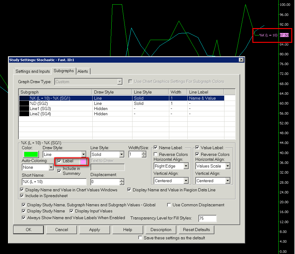
Subgraphs Tab >> Text To Draw
Text to Draw specifies the actual text to display by the study Subgraph when using the Text, Transparent Text, or Text with Background Draw Style. There is a limit to the number of characters this can be.
Subgraphs Tab >> Short Name
This setting displays and sets an alternative name for the study Subgraph which is displayed on the chart and in the Chart Values windows.
This name can be longer or shorter than the default. It does not matter.
Subgraphs Tab >> Displacement
This setting offsets the study Subgraph. A positive displacement will shift the Subgraph towards the right, and a negative displacement will shift the Subgraph towards the left.
If you wish to use a common displacement for all of the subgraphs, then enable the Use Common Displacement option on the Subgraphs tab. In this case the displacement of the 1st Subgraph controls the other Subgraphs.
When a study Subgraph is forward displaced and you scroll past the last bar in the chart using the scrollbar at the bottom of the chart, or any of the other supported methods to scroll the chart, then you will see the Subgraph line drawn past the last bar of the chart into the future.
Note that when using the Displacement option, any alerts or references to the Subgraph that is displaced, will use the value of the Subgraph at the location specified. For example, if a Subgraph has the following values for the three most current bars: 450, 300, 200 where the value of 200 is the most recent bar, 300 is one bar back, and 450 is two bars back; and an Alert exists that uses that Subgraph, such as =ID1.SG1 > 400, then when the subgraph is displaced by a value of 2, the alert will be triggered, since a value of 450 is greater than 400.
It is not possible to displace studies like the Volume by Price or TPO Profile Chart studies.
Subgraphs Tab >> Name and Value Labels
For each Subgraph line in a study, it is possible to display Name and/or Value labels. Refer to the chart image below for an example. Follow these instructions to do this:
- Refer to the Adding/Modifying Studies section to open the Study Settings window for the study.
- Select the Subgraphs tab.
- In the list of Subgraphs, select a particular Subgraph you want to set the Name and Value labels for. Make sure you are selecting the correct Subgraph. For example, if you want to set a Value Label for the last trade price for a study that displays chart bars, it is necessary to select Close SG4.
- To display the Subgraph Name Label, enable the Show option for the Name Label for the selected Subgraph on the Subgraphs tab of the Study Settings window.
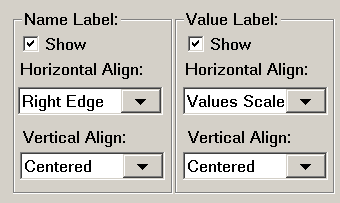
- To set a different name for a Subgraph rather than the default name, then specify this name in the Short Name box for the Subgraph. This Short Name will then be used for the Name Label.
- To display the Subgraph Value Label, enable the Show option for the Value Label for the selected Subgraph on the Subgraphs tab of the Study Settings window.
- There are several options for Vertical and Horizontal Alignment. Set these as you require. They are described below.
- Left Edge: This horizontal alignment option will display the label on the left side of the chart window.
- Left: This horizontal alignment option will display the label at the end of the Subgraph at the last displayed bar. The right side of the label will be aligned to the end of the Subgraph.
- Right: This horizontal alignment option will display the label at the end of the Subgraph at the last displayed bar. The left side of the label will be aligned to the end of the Subgraph.
- Right Edge: This horizontal alignment option will display the label on the right side of the chart window.
- Values Scale: This horizontal alignment option will display the label within the right side Values Scale. When using this particular Horizontal Alignment, you may want to add space to the right side of the chart and lock it. For instructions, refer to Right Side Fill Space.
- Label Column: This will display the label in the Chart/Trade DOM Label Column if it has been added to the chart. Otherwise, the label will not display. To add this column, refer to Customize Chart/Trade DOM Columns.
- Custom Coloring: To change the color of the Name and Value labels, enable the Subgraphs >> Label (Color) option and then use the colored button to the right of this checkbox to change the color.
- These Name and Value labels display beside the study Subgraphs on the chart (see image below). They are not for the display of the Subgraph Names and Values on the Region Data Line at the top of the chart region the study is located in. For the Region Data Line, use the Display Name and Value in Region Data Line Subgraph option.
- If the study Subgraphs do not extend all the way to the last bar in the chart, then it is necessary to enable the Always Showed Name and Value Labels When Enabled option on the Subgraphs tab to allow the labels to display.
Labels Not Visible: When a study Subgraph does not extend to the very last bar on the chart, then the Subgraph Name Label and Value Label will only display when Always Showed Name and Value Labels When Enabled is enabled on the Subgraphs tab of the Study Settings window. Therefore, in the case when a study Subgraph does not extend to the very last bar on the chart, and you do not see Name and Value labels that you have enabled, then make sure Always Showed Name and Value Labels When Enabled is enabled.
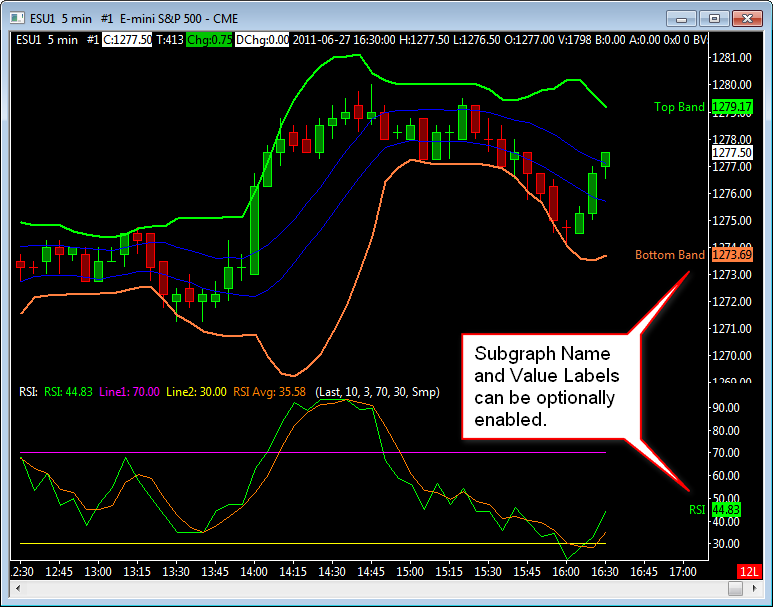
Label for Study Bars Not Updating
In the case where you have set a Value Label intended for the closing/last price for a study that displays bars (OHLC Bars, Candlestick Bars, ...), and it is not updating when you expect, it is necessary that you have set this on the Close (SG4) Subgraph. You probably have set it on the Open (SG1)Subgraph.
The solution is to follow carefully through the Subgraphs >> Name and Value Labels instructions and make sure you set the Value Label on the Close Subgraph.
Subgraphs Tab >> Display Name and Value in Chart Values Windows
When this option is enabled, the Subgraph Name and Value are displayed in the Window >> Chart Values Window, Window >> Tool Values Window and the Compact Tool Values Window. Otherwise, the Subgraph Name and Value will not be displayed and can save space. This option applies to the individual selected Subgraph in the Subgraphs list. Each Subgraph has its own independent setting.
The Compact Tool Values Window currently only displays the values for the first study (graph) or main price graph in the Chart Region being pointed to with one of the chart tools, such as the Chart Values tool. Therefore, in the case of a study in Chart Region 1, even if you have enabled Display Name and Value in Chart Values Windows, you will not see the values for it in the Compact Tool Values Window because it is the second graph in that region.
Subgraphs Tab >> Display Name and Value in Region Data Line
When this option is enabled, the Subgraph name and value are displayed in the Region Data Line at the top of the region that the study is located in.
Otherwise, the Subgraph name and value will not be displayed and can save space. This option applies to the individual selected Subgraph in the Subgraphs list. Each Subgraph has its own independent setting.
This option is ignored, when the Draw Style for the Subgraph is set to Ignore. In this case, the Subgraph Name and Value will not display in the Region Data Line.
Subgraphs Tab >> Include in Summary
When this option is enabled the study Subgraph will be included in the Study Summary window assuming that Settings and Inputs >> Include in Study Summary is enabled as well for the study. For more information, refer to Study Summary.
Subgraphs Tab >> Include in Spreadsheet
When this option is enabled, the study Subgraph will be outputted to the Spreadsheet Sheet used by the Spreadsheet Study if that study is on the chart.
For more information, refer to Using the Spreadsheet Study.
Subgraphs Tab >> Use Transparent Label Background
When this option is enabled, the labels for the study Subgraph will be set to have a transparent (not visible) background.
Since the coloring for the labels uses the background color for the label name/value, by default, it is recommended to enable the option for Reverse Colors for the label when using this option.
Subgraphs Tab >> Display Study Subgraphs Name and Value - Global
When this option is enabled, then the Name and Value for each Subgraph will be displayed in the Chart Values, Tool Values and Compact Tool Values Windows and in the Region Data Line if the individual Subgraph option Subgraphs >> Display Name and Value in Region Data Line is also enabled.
Otherwise, they will not be displayed even when the individual Subgraph option Subgraphs >> Display Name and Value in Region Data Line is also enabled
Subgraphs Tab >> Display Study Name
When this option is enabled, then the main study name will be displayed in the Chart Values Windows and in the Region Data Line. Otherwise, it will not be displayed.
Subgraphs Tab >> Display Input Values
When this option is enabled, then study Input values will be displayed in the Chart Values Windows and in the Region Data Line. Otherwise, they will not be displayed.
If Global Settings >> General Settings >> Charts >> Charts >> Hide Study Inputs on Charts is enabled, then regardless of whether Display Input Values is enabled or not, the Study Inputs will not be displayed on the chart in the Region Data Line area. Therefore, when you have Display Input Values enabled in the Study Settings, be sure to disable Hide Study Inputs on Charts in the Global General Settings.
Subgraphs Tab >> Always Show Name and Value Labels When Enabled
When this option is enabled, then the Name label for a study Subgraph will always be displayed when the Show option is enabled for Name Label for the Subgraph, even when the label would not normally be displayed.
When this option is enabled, then the Value label for a study Subgraph will always be displayed when the Show option is enabled for Value Label for the Subgraph, even when the label would not normally be displayed. One reason the label would not be displayed is that at the last displayed column/bar in the chart, there is no data available for the study Subgraph. In this case, the prior value of the study Subgraph will be used for the label.
Subgraphs Tab >> Use Common Displacement
When this option is enabled, then the displacement of the 1st Subgraph controls the other Subgraphs.
Subgraphs Tab >> Resolve Full Names for Reference Inputs
When this option is enabled and the study that contains this option has an Input for Study and Subgraph to Reference, then the information for the referenced Study and Subgraph is displayed in the Region Data Line and in the Chart Values Window as Study Name|Subgraph Name where the Study Name is the name of the referenced study and the Subgraph Name is the name or Short Name (if provided) of the referenced Subgraph.
Otherwise, when this option is not enabled and the study that contains this option has an Input for Study and Subgraph to Reference, then the information for the referenced Study and Subgraph is displayed in the Region Data Line and in the Chart Values window as IDx.SGy, where x is the Number of the study and y is the number of the Subgraph.
Subgraphs Tab >> Display Values When Hidden
When this option is enabled and the study that contains this option is hidden, then the values from this study will be displayed in the Tool Values Window. Otherwise, the values are not displayed in the Tool Values Window.
Subgraphs Tab >> Use Chart Graphics Settings for Subgraph Colors
This option is only allowed to be set when the Graph Draw Type setting on the Subgraphs Tab is a setting other than Custom. In this case, the Graph Draw Types will be various price bar types.
When this option is enabled, then the colors for the price bars will be controlled through either Chart >> Graphics Settings, if using chart specific graphics settings or Global Settings >> Graphics Settings.
If this option is disabled, then the price bar colors will be controlled through the Subgraph Color settings you specify on the Subgraphs Tab of the Study Settings window for the study.
For complete documentation for the color settings for the various Graph Draw Types when this option is disabled, refer to the Color Settings for Graph Draw Types page to know which color settings control each specific element of a bar.
Subgraphs Tab >> Transparency Level for Fill Styles
This setting displays and sets the the transparency level for the transparent study Draw Styles. This includes Transparent Fill Top and Transparent Fill Bottom Draw Styles.
0% represents no transparency and would be completely opaque, in other words completely filled in. 100% represents complete transparency and the filled area would not appear. Values between 0% to 100% represent varying levels of transparency.
Quick Access to Study Settings
Above any Chart Region on a chart is a line of text displaying data from the studies, the main price graph, or both. This is known as the Region Data Line.
When you right-click with your Pointer on that line of text, a menu will display that contains the names of the studies in that same Chart Region, along with their unique study identifiers. Each Chart Region has its own Region Data Line.
If you have hidden the Region Data Line for a particular Chart Region, then you will not be able to access that menu for the studies in that particular Chart Region. Region Data Lines can be made hidden and visible through Chart >> Chart Settings >> Regions >> Region Data Lines. If the Region Data Line is hidden, then you can right-click anywhere else in the Chart Region. On the displayed Chart Shortcut menu, select Study Settings and then the particular study that you want to modify the settings for.
Selecting any study from that list will immediately open the Study Settings window for that study.
Once the Study Settings window is open, modify the settings as you require and press either OK, or press Apply to see the changes without closing the Study Settings window.
When you right-click on the Region Data Line, you will also see a Remove submenu. This lets you remove any selected study from that submenu quickly.
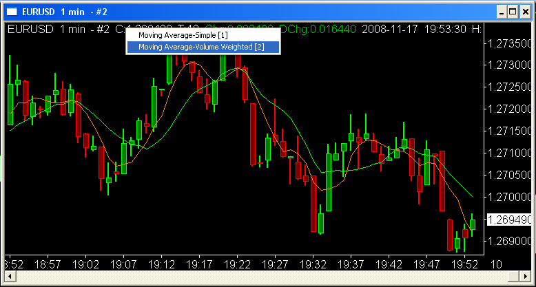
Also refer to Changing Study Inputs Directly from Chart.
Changing Study Inputs Directly from Chart
It is supported to modify a study Input directly from the chart window, by using the keyboard.
This feature is primarily meant as an interface for an external program to modify study Inputs.
When a chart is active, type the new Input value following the below format and press the Enter key on the keyboard. The letters are not case sensitive.
In:Id[Study ID Number].In[Input Number]=[value] Example: In:Id2.In1=10 .
As you type the letters they appear on the title bar of the chart. Refer to the image below.
It is supported in version 2209 and higher to change Date and Time Inputs. The date format is YYYMMDD. The time format is HH:MM:SS.ms, HH:MM:SS or HH:MM. In the case of a Date and Time Input, both the Date and Time can be inputted as a single text string separated by a space character.
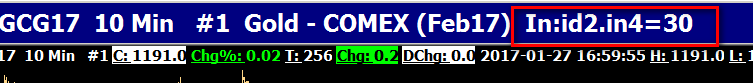
This image shows the Input Numbers to identify a particular Input in the list of study Inputs.
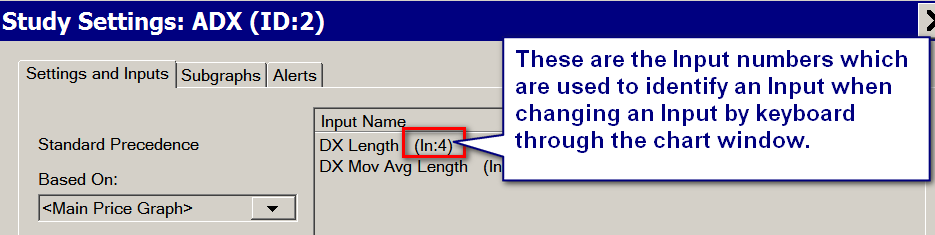
Hiding and Showing Study Directly from Chart
A chart study can be hidden or shown very easily directly from the chart. Follow the instructions below:
- Right-click on the Region Data Line above the Chart Region that contains the study. The Region Data Line contains text information for the graphs in that Chart Region.
- You will see Hide and/or Show submenus.
- To hide a study, select its name from the Hide submenu.
- To show a study, select its name from the Show submenu.
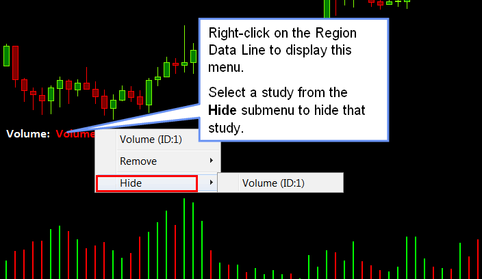
One thing to be aware of is hiding and showing studies in this way does not cause a recalculation of those studies, for efficiency reasons. When using this method to hide a study and that study uses what are called Chart Drawings (drawings added through the Tools menu), those drawings will not be hidden. To cause them to be hidden you need to select Chart >> Recalculate after hiding the study.
Using Custom Default Study Settings
To use custom default settings for a study:
- Open the Study Settings window for a study by following the Adding/Modifying Chart Studies instructions.
- On the Settings and Inputs tab.
- Set the Study Settings as desired to be the defaults.
- Press the Set Defaults button.
The next time you add a new instance of the study from the Studies Available list, the new default settings will be used.
Also refer to the information for Study Collections. This is another way to use custom Study Settings.
Resetting Default Study Settings For an Individual Study
To reset all of the settings back to the original internal defaults for a study, follow the steps below.
- Open the Study Settings window for the desired study. The study will need to be in the Studies to Graph list first before it can be reset back to default settings.
- Press Reset Defaults button.
- Press OK to confirm.
The next time that study is added to a chart, it will not use the custom default settings, but will use the standard default settings.
Resetting Default Study Settings For All Studies
To reset the defaults for all of the studies to be certain you are back to the defaults for all of the studies, go to the folder you installed Sierra Chart to and delete the DefaultStudySettings folder. Sierra Chart can be running when you do this.
Password Protecting Studies
In Sierra Chart you are able to password protect studies. This allows you to hide the original name of the study, Subgraph names, Inputs and prevent changing of the Inputs. Follow these steps to password protect a study.
- Open the Study Settings window for the study.
- On the Settings and Inputs tab, enter a Short Name.
- Set all of the Study Inputs as you require.
- On the Subgraphs tab enter a Short Name for each Subgraph to hide the original name.
- Go back to the Settings and Inputs tab and enable the option Protect with Password. Enter a password and press OK.
- The study is now password protected. Next time you go into the Settings you will see that the names and Inputs cannot be seen. They will also not be displayed on the chart or Chart Values Windows.
Preventing Study From Compressing Main Price Graph
- Select Analysis >> Studies on the menu.
- Select in the Studies To Graph list, one of the studies that is set to display in Chart Region 1.
- Press the Settings button to open the Study Settings window.
- Press the Scale button. Refer to the image.
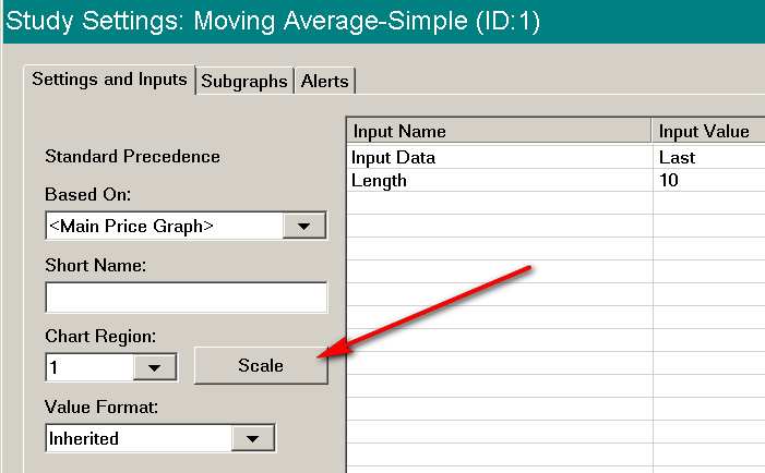
- Set the Scale Range to Same As Region. Refer to the image.
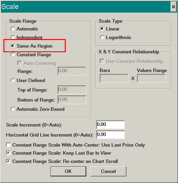
- Press OK. Press OK.
- Repeat steps 2 through 6 for each study that is displayed in Chart Region 1.
- Press OK.
Adjusting Study Settings Input Regions
The two regions in the Study Settings Input region can be adjusted to show more or less of either the Input Name or Input Value.
To adjust this region, place the Pointer in the horizontal line separating these two areas in the window. The Pointer will change shape to indicate that it is in the correct position to adjust the region sizes. Hold down the left Pointer button and adjust the size to the left or right as desired to set the size. See the image below for indicators of how to make the adjustment.
Note that it is not possible to change the size of the Study Settings window. If the Input Name or Input Value regions are made larger, a scrollbar will be available to move the window left and right to see all the information.
The full text of an Input Name will always be shown in the bottom of the Study Settings window after selecting the particular Input setting, as shown in the image below.
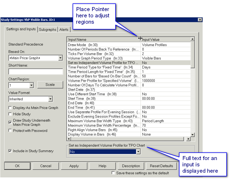
Displaying a Study with Both Bars and Bounding Line
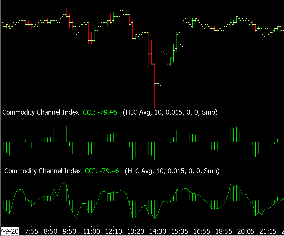
The image above shows the Commodity Channel Index study displayed with bars and with and without a bounding line. Follow the instructions below to add a study with both bars and a bounding line to the chart. The following instructions use the Commodity Channel Index study as an example, this same process can be used for any study that displays as bars. For general information on adding and modifying studies and their related settings refer to Adding/Modifying Chart Studies.
- Select Analysis >> Studies to open the Chart Studies window.
- Select the Commodity Channel Index study in the Studies Available section and select the Add button to add this study to the chart.
- Set the Commodity Channel Index study settings as desired. Do not change the Subgraph setting CCI - this setting is set to Bar by default and is the base bar graph that will be used. Press OK to close the Settings window if any changes have been made.
- On the Chart Studies Window select the Commodity Channel Index study in the Studies Available section and select the Duplicate button to create an exact copy of the first study.
- Select this second instance of the Commodity Channel Index in the Studies to Graph section on the right and select the Settings button.
- Select the Subgraphs tab.
- Select the first Subgraph named CCI in the Subgraph section at the top of this page.
- Change the Draw Style to Line.
- Change the Line Style and Width as desired.
- Select the checkbox next to Display Study Name, Subgraph Names, and Subgraph Values - Global to turn off the display of this study information. This is not required, but the information from the first study is already displayed and therefore leaving this on would only display a repeat of the information.
- Select OK to close the Study Settings Window.
- Select OK to close the Study Window and have the graph displayed on the chart.
There are various options available for how to combine graphs together to obtain a specific look. For example, rather than using the Line option, setting the Draw Style to Transparent Fill to Zero will display a transparent coloring over the bars. It is also possible to combine more than two studies, therefore it is possible to add a third study with the Draw Style set to Line, which will display along with the Bars and Transparent Fill to Zero studies.
Avoiding Vertical Joining Line for Study Subgraphs

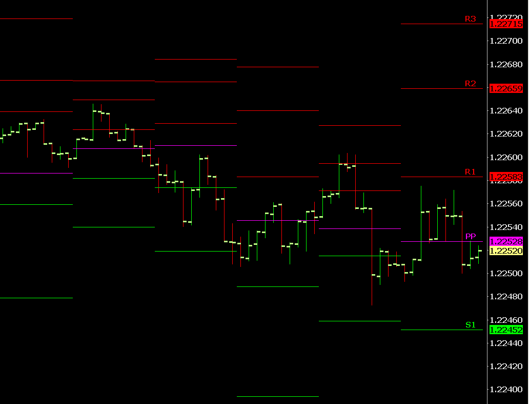
The images above show the Pivot Points study displayed with Lines that connect together and jump from one Pivot Point to the next, and then with Lines that are not connected together, therefore not showing the jump between the Pivot Points.
Follow the instructions below to add a study to the chart and change the Subgraph Draw Style in order to remove the adjoining line between items.
The following instructions uses the Pivot Points - Variable Period study as an example. This same process can be used for any study that displays as Lines. For general information on adding and modifying studies and their related settings, refer to Adding/Modifying Chart Studies.
- Select Analysis >> Studies to open the Chart Studies window.
- Select the Pivot Points - Variable Period study in the Studies Available section and select the Add button to add this study to the chart.
- Set the Pivot Points - Variable Period study settings as desired.
- Select the Subgraphs tab.
- Select the first Subgraph named R1 in the Subgraph section at the top of this page.
- Change the Draw Style from Line to Dash or to Line-Skip Zeros.
- Change the Line Style and Width as desired.
- Repeat steps 5-7 for the other displayed Subgraphs.
- Select OK to close the Study Settings Window.
- Select OK to close the Study Window and have the graph displayed on the chart.
Adding a Horizontal Line to an Existing Study
Follow the instructions below to add a horizontal line to an existing study in the same Chart Region.
- Select Analysis >> Studies.
- Add the study, if it is not already added, that you want to add an additional horizontal line to.
- Select that study in the Studies to Graph list. Press the Settings button to open the Study Settings window.
- Press the Scale button. Make sure the Scale Range is set to Automatic.
- Press OK. Press OK.
- In the Available Studies list, select the Line study.
- Press Add.
- Press Settings button. Select the Settings and Inputs tab.
- Set the Value input to the level where you want the line displayed at.
- Set the Chart Region setting to the very same chart region where the existing study that you want to add additional horizontal line to, is located.
- Press the Scale button and confirm that the Scale Range is set to Automatic as well. Press OK.
- Select the Subgraphs tab and set the Color and Line Width.
- If you want to use a different Draw Style other than a line, then change the Subgraph Draw Style setting to what you want to use.
- Press OK. Press OK. Refer to the image below for an example.
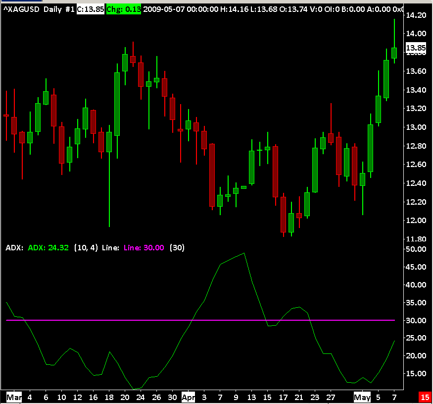
Hiding a Study Subgraph within a Study
There may be cases where you do not want to see a particular Subgraph of a study and you will want to hide it. Follow these instructions to do that:
- Open the Study Settings window for the study. For instructions, refer to Adding/Modifying Chart Studies.
- Select the Subgraphs tab.
- Select in the list of Subgraphs the particular subgraph that you want to hide.
- Set the Draw Style for it to Ignore. Refer to the image below.
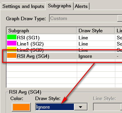
Hiding Subgraphs to Prevent Display of Study when Unhiding Studies
The ability to hide the Subgraphs can also be used to ensure that a particular study stays hidden when using the Menu Command to Unhide All Studies. To do this, follow these instructions for the study that is to remain hidden:
- Change all the Study Subgraphs to Ignore as described above.
- Set the Chart Region for this study to 1.
- If desired, the data from the hidden study can be displayed on the chart using the Text Display for Study study.
Study Display Order
The order in which studies are drawn on the chart is according to how they are listed in the Studies to Graph list on the Chart Studies Window. The first study in the list is drawn first and the last study in the list is drawn last.
To open the Chart Studies window, select Analysis >> Studies on the menu.
Select a study in the list of Studies to Graph on the Chart Studies window and use the Move Up and Move Down buttons to reorder the study relative to other studies.
In the case of a study which displays as the main price graph like the TPO Profile Chart study, make sure it is at the top of the Studies to Graph list so the standard chart header line is displayed in the Region Data Line at the top of the chart.
The order in which Study Subgraphs are drawn within a study cannot be reordered and is according to the internal order of Study Subgraphs with the study.
In the case of when studies are displayed in Chart Region 1, where the main price graph is, studies can be displayed above the main price graph or underneath the main price graph within the same Chart Region. Each chart study has a Draw Study Underneath Main Price Graph setting on the Study Settings Window for the study to control this.
Chart Studies and Chart Drawings
It is possible to display Chart Drawings from Chart Drawing Tools, above or below studies. To control this, refer to Controlling Display Order of Chart Drawings Relative to Graphs.
Using Transparency
One method that helps to see a study which is displayed under another study which is covering it is to set the study that is covering it to use Transparent Draw Styles.
It is also useful to use Transparent Draw Styles to see Chart Drawings that are displayed under Study Graphs which occupy a large area of the chart because they use the Fill Draw Styles.
In the case of the Volume by Price study, transparency is enabled through in the Volume by Price Study Inputs.
Scale Values
The scale values on the right side scale will display the range of values for all studies within the Chart Region which are set to an Automatic Scale Range.
If the first study in the Chart Region according to its study display order, has a Scale Range which is different than the other studies in the same Chart Region, then the scale of values on the right side will be for that first study in the Chart Region.
Study Calculation Precedence And Related Issues
There are various rules for determining the order in which studies are calculated on a chart. The significance of the calculation order is that a study which depends upon another study must be calculated after, the study or studies that it depends upon.
For the most part, this is an automatic process that you do not need to be concerned about. However, there are cases where Sierra Chart cannot determine the calculation order properly and you will have to make some adjustments. Refer to the How Calculation Order of Studies Is Determined section for the calculation order rules.
There are many details to determining the calculation order of studies. The first general rule is that they are calculated in the order that they exist in the Studies to Graph list on the Chart Studies window opened with Analysis >> Studies.
Use the Move Up and Move Down buttons (refer to the image below) to change the calculation order if you have any problems with studies not calculating and displaying properly due to the rules described in the How Calculation Order of Studies Is Determined section.
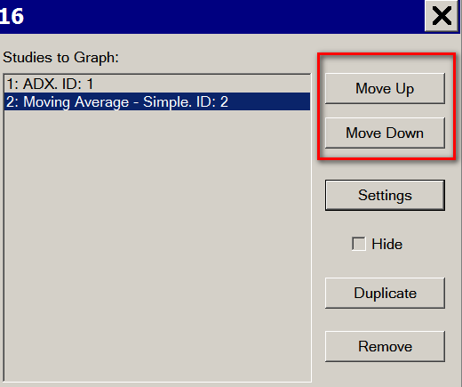
The 2nd general rule is that the calculation order of studies is determined by the precedence that each study has in relation to each other. Once again, this is explained in the How Calculation Order of Studies Is Determined section.
The following built-in studies have a Low Calculation Precedence. These are calculated after other studies with a Standard Calculation Precedence (These are studies which do not have a Low Calculation Precedence or Very Low Calculation Precedence).
- Spreadsheet Study
- Trade Management by Study
- Correlation Coefficient
- Study Subgraphs Difference
- Color Bar Based On Above/Below Study
- Study Subgraphs Reference
- Study Subgraphs Average
- Cumulative Sum Of Study
- Reference Study Data
- Study Subgraphs Add
- Study Subgraphs Multiply
- Study Subgraphs Ratio
The following built-in studies have a Very Low Calculation Precedence:
- Spreadsheet System/Alert
- Spreadsheet System for Trading
- Color Bar Based On Alert Condition
- Color Background Based On Alert Condition
Studies with a Very Low Calculation Precedence level means they are calculated after other studies with a Low Calculation Precedence level.
An ACSIL study can control its calculation precedence level through the sc.CalculationPrecedence member.
Chart Values and Spreadsheet Studies
When you are viewing the values of studies on the chart or in the Chart Values Windows, then these values you are seeing are after all of the studies on the chart have been calculated.
You may notice differences when comparing those values to the values you see on a Spreadsheet because the study values on a Spreadsheet are the values that existed, if they exist at all, at the moment in time the particular instance of the Spreadsheet Study was calculated, which is based upon the order of studies in the Studies to Graph list and the calculation order rules.
You will not have any differences with values unless you have studies which make references to other studies and the Spreadsheet Study being used is not at the end of the calculation order.
Circular Study References When Using the Spreadsheet Study
If you are using chart studies which are Based On a Spreadsheet study and you are also using the results of those studies in the same Spreadsheet, then you have created what is known as a circular reference. Although these studies are outputted to the Spreadsheet, the data from them cannot be used because of the fact that these studies are calculated after the instance of the Spreadsheet study they are based on, and the data outputted for these studies at the time the Spreadsheet study is calculated, is old, incomplete, and/or nonexistent. Incomplete would mean that only 10 rows of data are outputted.
You simply cannot base studies on the Spreadsheet study and use the results of those studies in the very same Spreadsheet. This is an impossible circumstance to resolve.
Instead, what you need to do, if you need to perform calculations on those studies which are based on the Spreadsheet Study is to use another Spreadsheet Study, which those studies are not Based On. Make certain that other Spreadsheet Study is at the end of the Studies to Graph list in the Chart Studies window. You may also want to be aware of the various arithmetic studies we have which can in some cases eliminate the need for the Spreadsheet Study. They are as follows:
- Study Subgraph Add
- Study Subgraphs Add
- Study Subgraph Subtract
- Study Subgraphs Difference
- Study Subgraph Multiply
- Study Subgraphs Multiply
- Study Subgraph Divide
- Study Subgraphs Ratio
How Calculation Order of Studies Is Determined
To quickly determine how Sierra Chart has determined the calculation order of a study relative to other studies, refer to the CalcOrder: value displayed after each study in the Studies to Graph list in the Chart Studies window. Refer to the image below.
A lower number in the calculation order means that the study is calculated before studies with a higher number. So if the study has a Calc Order of 1, it is the first study calculated. If it has a Calc Order of 2, it is the second study calculated. So in other words, the study with Calc Order of 2 is calculated after a study with Calc Order of 1.
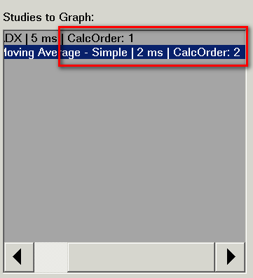
The following describes the rules for determining the order in which all graphs/studies are calculated.
When determining the calculation order for a chart, references to all of the graphs/studies in the chart are moved from one list, representing the internal list, to another list, representing the calculation order.
The order of the internal list is the same order that studies are listed in the Studies To Graph list in the Chart Studies window. Although the base graph is not listed in the Studies To Graph list, it is the first item in the internal list, before all the studies.
Moving items from one list to another ensures that no items are duplicated (no study is calculated twice), and no infinite loops are created.
When inserting graphs/studies into the calculation order list, the place in the list that they are inserted may be based upon a precedence level. There are four levels of precedence. These are called groups in the internal precedence calculator class. They are in this order:
- Base Graphs. A study will be a base graph if it has Display as Main Price Graph enabled or it functions as a base graph.
- General Studies
- Low Precedence Studies
- Very Low Precedence Studies
The studies/graphs in the Base Graphs group get calculated first, and the studies/graphs in the Very Low Precedence Studies group get calculated last.
When determining where to insert a graph/study, the following things are checked in this order:
- Is the study a base graph?
If so, it will be inserted at the end of the Base Graphs group. - Does the study have a custom size? (custom base graph)
If so, it will be inserted at the end of the Base Graphs group. - Is the study a very low precedence study that is based on a higher precedence study? *[1]
If so, it will be inserted at the end of the Very Low Precedence Studies group. - Is the study based on another study?
If so, it will be inserted immediately after the study that it is based on. *[2] - Does the study have a "very low" calculation precedence?
If so, it will be inserted at the end of the Very Low Precedence Studies group. - Does the study have a "low" calculation precedence?
If so, it will be inserted at the end of the Low Precedence Studies group. - Do any of the study's inputs reference another study?
If so, it will be inserted immediately after the study that it references. *[3] - Does the study have an Alert Condition Formula that references another study?
If so, it will be inserted at the end of the Low Precedence Studies group.
Otherwise, if the study does not match any of the above conditions, it will be inserted at the end of the General Studies group based upon the order the study exists in the Studies to Graph list in the Chart Studies window.
*[1]. A study is considered "a very low precedence study that is based on a higher precedence study" iff the study has a "very low" calculation precedence, and it is based on another study (that exists), and the study that it is based on has either a "low" or "standard" calculation precedence level.
*[2]. If a study is based on a study that does not exist, the study will be inserted at the end of the General Studies group instead.
*[3]. Inputs with the value types: STUDYID_VALUE, STUDY_SUBGRAPH_VALUES, CHART_STUDY_SUBGRAPH_VALUES, and CHART_STUDY_VALUES may reference another study. The last two will only count if the chart in the Input is the same as the chart that the study is on. If an Input references the same study that it is on, that Input is ignored, because it is not referencing another study. If the study that the Input references does not exist, then that Input is ignored. If a study has more than one valid Input study reference, then the Input reference with the greatest index in the unmodified internal list is used.
Notice that when studies are inserted into a precedence level group, they are always inserted at the end of the group. This maintains the original internal order of the studies when they end up in the same group, assuming no other conditions cause the order to change.
Basing Study Calculations on Set Time Range in Chart
When adding a study to a chart the study will use the time as it is set for the chart in the Session Times.
If the chart times are not what is required for the study, then the Session Times need to be changed to match what is desired for the study. If necessary, create a copy of the chart and modify the Session Times on the copy of the chart and add the study to the new chart. Refer to Duplicate Chart for more information on how to copy a chart.
To view the accumulated information from a study at the end of the trading day (as defined by the Session Times), use the Cumulative Sum of Study study.
References to Other Charts and Tagging
A study on one chart can reference the main price graph of or a study on another chart. The chart that a study is referencing is considered the source chart. The chart that the referencing study is on is considered the destination chart.
When a study references a source chart, and data in the source chart changes, the destination chart is notified of this and the studies on the destination chart are calculated so that they can make reference to the up-to-date data in the source chart.
When the data in the source chart changes at an earlier bar than the last bar in the chart, then the destination chart is tagged for a full recalculation.
The following are the conditions in a source chart which will cause a destination chart to be tagged by the source chart:
- A historical data download completes.
- Study settings are modified.
- Chart Settings are changed.
- The chart is opened as part of a Chartbook.
- A full study recalculation occurs in the source chart for some reason.
- Chart >> Reload and Recalculate is selected or a reload of chart data occurs for some other reason.
In the case of when a source chart tags a destination chart for a full recalculation, you will see messages like the following added to the Sierra Chart Message Log:
Chart #2 is performing a full recalculation because it has been tagged. Chartbook: C:\SierraChart\Data\Chartbook1.cht
There are two potential issues which can result in frequent recalculations of charts referencing other charts. They are:
One way to avoid references to other charts is to use the Add Additional Symbol study which is an alternative if the purpose you are referencing another chart is just to access data from another symbol but the bar timeframe is the same between the charts.
Resolving Study Not Visible Issue
Follow the instructions below to resolve the problem where a study does not display on the chart.
- The first step is to see if the study has nonzero values among the visible chart bars. Use the Chart Values tool for this. You will see the data in the Tool Values Window.
If the study only has zero values, then this is the reason for the problem and the solution to this is going to vary based upon the study. - If the study has Length Inputs, and you have used large/high values for those Inputs, then there may not be enough data loaded in the chart. In this particular case you will need to increase amount of data in the chart through the Days to Load setting in Chart Settings.
For example, if a Length input is set to 100, and there are fewer than 100 chart bars in the chart, the study will not display. If there are 150 chart bars in the chart, then the study will only display on 51 of the chart bars and not bars 1 through 99.
In the case of futures charts, to load more historical data which spans multiple futures contracts which is necessary for a longer term chart, requires that you use the Continuous Futures Contract feature and not only increase the Days to Load setting. Both have to be done. - On the Subgraphs tab of the Study Settings for the study, check to make sure the Draw Style for the Subgraphs you want to see are not set to Hidden or Ignore.
- On the Subgraphs tab of the Study Settings for the study, check to make sure the Primary and Secondary Color settings for the Subgraphs are set to visible colors.
- To make sure the scales for the chart are in their default state and have no Interactive Scale Move/Range adjustments, select Chart >> Reset Scales.
- The next step is to expand the range of prices in the chart by using Interactive Scale Range for Chart Region 1 assuming the studies are in Chart Region 1. Do this in order to see if the study Subgraphs which are not currently visible become visible after expanding the range of prices in the chart. The objective is to compress the main price graph bars in order to see a greater range of prices and to see the study Subgraphs.
- Check the Scale Settings for the study to make sure they are set as intended.
If the study is set to display in Chart Region 1 where the main price graph is, then set the main price graph Scale Range to Automatic.
In most cases the study should have a Scale Range set to either Automatic or Same as Region. Verify this is the case. - Contact Sierra Chart Support for further help.
Using Transparency
Some of the study Subgraphs >> Draw Styles use transparency. Transparency means that a Subgraph plot is transparent and the graphics directly below it can be partially seen.
The level of transparency is set through the Transparency Level for Fill Styles setting on the Subgraphs tab. This is specified as a number from 0 to 100. A value of 0 means there is no transparency and the Subgraph is drawn completely solid and the graphics underneath cannot be seen. A value of 100 means that the Subgraph is totally transparent and will not be visible.
Transparency is accomplished through a color blending operation. The Subgraph Color setting is blended with the existing graphics below it. Therefore, the resulting color will be different than what you set.
Using transparency also requires higher CPU usage to perform the blending operation. Therefore, it can be disadvantageous to use for that reason.
Some studies like the Large Volume Trade Indicator and Volume by Price studies will have a Use Transparent Draw Style Input which enables transparency for those studies rather than through a Subgraph Draw Style.
Resolving Study Differences
This section explains the procedure to follow when there are differences between the same study on two different charts either within the same instance of Sierra Chart, or in different instances of Sierra Chart, when you expect them to display the very same output.
For help with differences with the Point of Control, Value Area High, Value Area Low for the Volume by Price, Volume Value Area Lines, TPO Profile Chart, or TPO Value Area Lines studies, refer to Incorrect Value Area or Point of Control Values. However, still refer to the information in this section below because the issue may be related to some other configuration difference explained in this section.
- The usual reason for a difference is differences in the underlying chart data. Therefore, the first step is to compare the settings in the Chart >> Chart Settings for each of the charts being compared. Many of the settings among each of the tabs need to be identical.
Related to this is that when you are using Number of Trades, Volume, Range, Reversal, Renko, Delta Volume, Price Change, Point and Figure Bars, it is recommended that in order for there to be consistency with the study results as the Days to Load setting is changed in the chart or additional days are added to the chart during real time updating of the chart, make sure that New Bar at Session Start in the Chart >> Chart Settings is enabled.
If the charts you are comparing, were opened at different points in time, select Chart >> Reload and Recalculate to load the equivalent number of days in each of the charts. The number of days loaded increases during real-time updating. - Check the Time Zone setting for the charts being compared, and also for the charts that are referenced by those charts, to be sure they are set to the identical Time Zone setting.
- Make sure the Days to Load Chart Setting is set high enough to load sufficient data based upon the Length or Time Period Unit / Length Input settings for the study.
- In the case of Historical Daily chart data for stocks, one instance of Sierra Chart may be set to adjust the historical data for dividends and another instance may not be set to adjust historical data. This is going to cause differences with studies between the charts in each instance. For further instructions on this, refer to Differences with Historical Data Due to Dividend Adjustments.
- If comparing charts between two different instances of Sierra Chart, make sure the Global Settings >> Data/Trade Service Settings >> Intraday Data Storage Time Unit is set the same between the two different instances of Sierra Chart. If this setting has to be changed in one of the instances and the charts being compared are Intraday charts, then it is necessary to go to the Intraday chart of the chart being compared in the instance where this setting has been changed, and re-download the data by selecting Edit >> Delete All Data and Download.
- If you are comparing between charts in different instances of Sierra Chart, then it is important that the chart data is identical between them. If they are Intraday charts, then re-download the data in each chart by selecting Edit >> Delete All Data and Download, if this was not already done in the prior step.
- Remove all of the studies from the charts being compared through Analysis >> Studies >> [select study in Studies to Graph] >> Remove.
- Add the Volume study to each of the charts being compared.
- Go to each of the charts being compared and select Chart >> Graph Draw Types >> Candlestick Bars to see the Open, High, Low, Close values.
- Visually compare the chart bars and the volume bars between the two charts being compared. Use the Chart Values tool to examine the chart values in detail. If you notice any differences, then this will be the reason for the differences with the study output between the charts being compared. Re-download the data for both of these charts with Edit >> Delete All Data and Download. This should make the chart bar data the same, assuming the same Data or Trading service is being used for the charts.
- Add the study being compared back to the charts.
- Make sure the Study Settings are the same between the two instances of the study on the charts being compared. All of the settings on all of the tabs of the Study Settings window must match between the two instances of the study on the charts.
- Make sure the Scale Settings are the same between the two instances of the study on the charts being compared. All of the Scale settings must be identical. You need to open the Scale Settings window for each individual study. And compare them.
- After following the above procedure, you should have resolved the problem at one of these steps.
First Bar Study is Visible At
Some studies may not display data from the very first bar in the chart. There are two primary reasons why this will occur, and these are discussed below.
Some studies, such as the Spreadsheet Formula, Spreadsheet Study, and Color Bar Based on Alert Condition only calculate a set number of bars based on an Input setting for the study itself. When a study contains an Input Setting for Number of Bars to Calculate, then only that number of bars will contain the results of the study, starting from the most recent bar and working backwards.
In the case of the Spreadsheet Studies, the number of bars that are calculated is controlled through the Study Input for Number of Rows. Since each row within a Spreadsheet Study relates to one bar, there is a direct correlation between this setting and the display of the calculated data from a Spreadsheet Study. Increasing these values will display data further back in the chart, but it will also increase the calculation time for the study. Conversely, decreasing this value will decrease the calculation time. The exact impact has to be determined for each study and can be affected by the performance of the system on which Sierra Chart is running. These Inputs are directly related to the number of bars and do not relate to time in any way directly. Therefore, as the time period for a chart is changed, the times at which the study will be displayed will also change. For example, a study set to calculate 120 bars on a 1 minute chart will display data for the most recent 2 hours, but if the chart is changed to 1 hour bars, then the study will display data for the most recent 120 hours. Some studies, such as the Moving Average, Highest High / Lowest Low Over N Bars, KD - Fast, and KD - Slow studies require a certain amount of data in order to properly calculate. In these cases, the display of the data does not occur until the required number of bars has been taken into account, starting from the beginning of the chart. In many of these cases, the amount of data is controlled within the study itself as the Length Input for the study. Therefore, the study will not be drawn until the bar that matches the Length input. For example, with a Moving Average - Simple study that has a Length Input set to 10, the Moving Average data will not be displayed until bar 10 in the chart.Study Controlled Number of Bars to Calculate
Study Requires a Certain Amount of Data Prior to Display
Adding Multiple Instances of the Same Study
It is supported to add multiple instances of the same study to a chart. To do this, simply follow the Adding/Modifying Chart Studies instructions for each instance of the study.
You will want to make sure you have the settings different for each of the studies. Also, be aware that there may be times when the studies will have the same values, therefore you will only see one of the lines.
If the study is not visible, refer to Resolving Study Not Visible Issue.
It is best to add one study at a time, and verify that it is configured as you require before adding another instance of the same study.
Reducing Processing Time for Studies
The processing time for a chart study consists of two components. The calculation of the study and the drawing of the study results. Initially when a study is added to the chart, a chart is recalculated, or a chart is loaded or reloaded, there is a full recalculation of the study. Thereafter, there is only an update calculation which is very efficient. The update calculation, is an negligible amount of processing.
Drawing of a study during real-time chart updating, potentially can take a significant amount of time depending upon the complexity of what is being displayed and the chart bar spacing. The lower the chart bar spacing, the more time to draw a study.
The time is not significant. Normally it will be less than 10 ms. It can be longer depending upon what is displayed. Or it could be significantly higher if you have a large monitor with no chart bar spacing, and there is a very complex display like a very dense TPO Profile Chart. Also the speed of your computer and whether OpenGL is being used or not, affects the drawing time. OpenGL should reduce the drawing time.
Hiding a study eliminates the graphics load from the study completely. It is the graphics load which is most of the processing. Although if the chart is not visible, the graphics processing is not occurring anyway.
To effectively disable a chart and the study processing, you just need to increase the Chart Update Interval of the chart to a significantly higher number. For example, you could set this to 10000 which would mean the chart only updates every 10 seconds.
You can also move charts and studies that you use less frequently to sub instances to distribute processing into a separate process and separate CPU threads.
*Last modified Thursday, 10th July, 2025.