Working With Charts
- Chartbooks and Opening a Chart
- Chart Numbers
- Templates and Duplicating Charts
- Setting the Price Display Format
- Chart Values Scale
- Left Side Scale
- Interactive Scaling: Compress/Expand Vertical Scale, Move Chart Up and Down
- Chart Window and Regions
- Time Scale
- Region Data Line / Chart Header
- Chart Title Bar
- Chart Settings Indicators at Lower Right of Chart
- Symbol Indicators
- Bar Countdown Timer
- Chart Colors and Fonts
- Viewing Charts in Multiple Monitors
- Scrolling the Chart and Right Side Fill Space
- Automatic Scrolling as New Bars are Added
- Chart Linking
- Changing the Chart Bars Timeframe
- Changing Bar Spacing
- Zooming In and Out
- Selecting Charts or Navigating Among Charts
- Working with Tabs
- Creating an Inset Chart
- Chart Data Files
- Using Chart Drawing Tools
- Displaying Current Price Line
- Overlaying Multiple Symbols in a Single Chart Window
- Resolving Chart Issues
- Charts Unexpectedly Scroll Back and Change Fill Space Amount
- Zooming into Bar by Decreasing Time Period per Bar
- Hiding Main Price Graph
- Out of Memory Condition
- Resolving Differences of Chart Bars Between Charts
- Error Creating Chart Windows and Trade Windows
- Stopping Chart Data Loading/Calculations
Chartbooks and Opening a Chart
For instructions to open a Historical or an Intraday chart, refer to Open Chart on the Getting Started page, or refer toTo Add a New Chart To a Chartbook on the Chartbook page.
Charts are contained within Chartbooks. For complete information to work with Chartbooks including adding and removing charts, refer to Chartbooks.
The following sections on this page have information for working with charts.
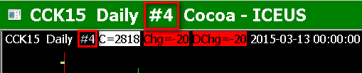
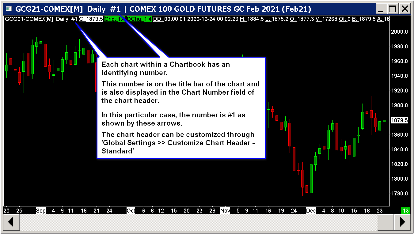
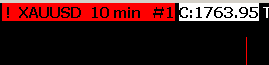
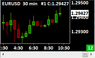
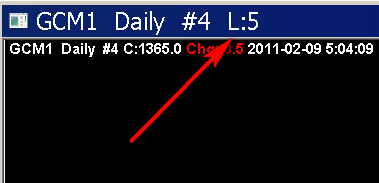
Chart Numbers
Each chart has a unique number to identify itself within the Chartbook where it is located.
When a new chart is opened or a chart is duplicated, the next lowest available number is used to identify the chart.
It is not possible to change the chart number.
The chart number is used with Study Inputs which select a particular Chart.
The following images shows the chart number:
Templates and Duplicating Charts
Any existing chart or Trade DOM window in a Chartbook can serve as a template for creating a new chart that is exactly like it. This is done by duplicating the chart. For complete instructions, refer to Using Chart Templates.
Setting the Price Display Format
Typically the Price Display Format for a symbol will be set automatically for you. This is managed through Global Settings >> Symbol Settings . If you need to change the Price Display Format, refer to Help Topic 32.
Chart Values Scale
The standard scale for the chart is displayed on the right side of the chart. To make changes to the Chart Values scale, right click over the scale numbers and select Scale Settings. All of the Scale settings are set in the displayed window.
The Scale Increment value sets the spacing between scale numbers on the right side of the chart. For the numbers to be set automatically, leave Scale Increment at 0.
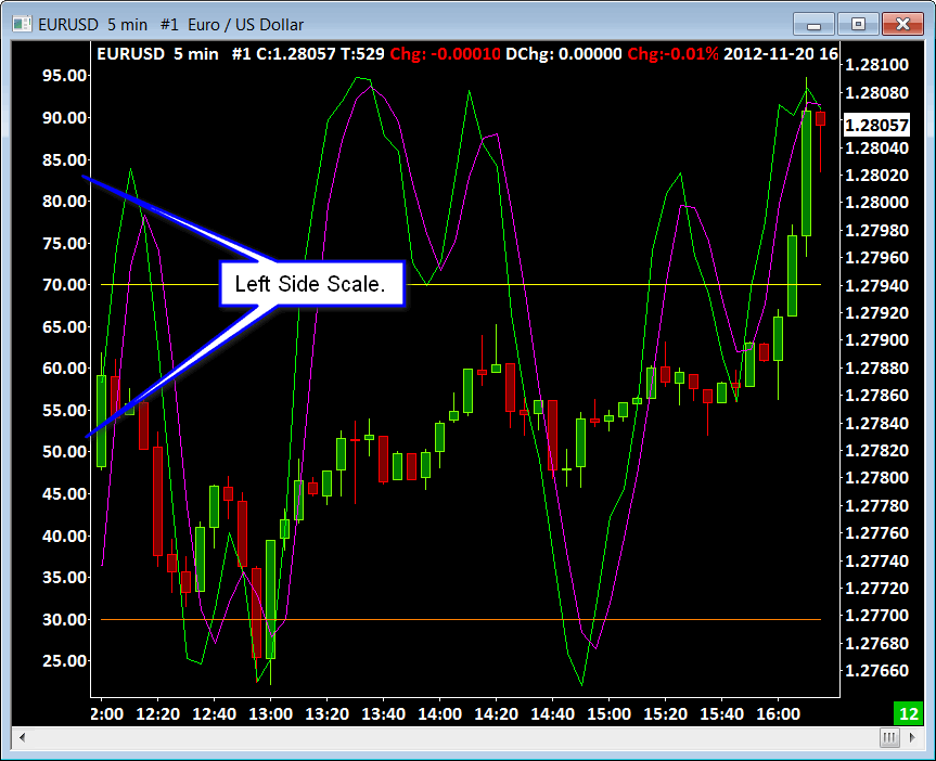
To display a scale on the left side of a chart, select Chart >> Chart Settings >> Scale and enable Use Left Side Scale.
The width of the right side price scale is not directly adjustable. However, the maximum width of the displayed studies scale numbers, can optionally be individually set to be used within the width calculation. To do this, open the Scale Settings for a study and enable or disable Include in Scale Width calculation.
Left Side Scale
To display a Values scale on the left side of the chart, enable Chart >> Chart Settings >> Scale >> Use Left Side Scale. This is useful when you have graphs displayed in a chart region that use different scaling. The left side scale will display the scale for the secondary graphs. For additional details, refer to Use Left Side Scale in the Chart Settings documentation.
Interactive Scaling: Compress/Expand Vertical Scale, Move Chart Up and Down
By using the Interactive Scaling functionality you can compress and expand the vertical scale to create space above and below a Chart Region or expand the graphs in the Chart Region to make them larger. You can also move the chart up and down interactively in the main chart region or in any chart region. For complete documentation, refer to the Interactive Scaling page.
Chart Window and Regions
The chart window contains many adjustable regions. The number of regions displayed depends on the chart regions the studies on a chart are set to be drawn in.
Each region contains one or more graphs. A graph would be a price graph or a study graph. The top line of a region shows the values for the last column of the graphs in the region.
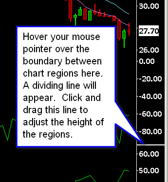
Adjusting the Height of Chart Regions By Using the Values Scale
You are able to adjust the height of the regions in the chart by hovering your Pointer over the boundary between the regions in the Values Scale on the right side of the chart.
Refer to the attached image below. As you hover over the boundary between chart regions you will see a horizontal line displayed. Click and drag with your Pointer device to adjust to the new height and release.
This feature is not supported when a Drawing Tool is active. To ensure a drawing tool is not active select Tools >> Pointer on the menu.
Adjusting the Height of Chart Regions By Using the Adjust Regions Tool
To adjust the height of the chart regions, select Tools >> Adjust Regions on the menu. Move your Pointer over the boundary of two regions on the chart, left click with your pointing device and drag to adjust the height. For complete instructions, refer to the Adjusting Regions section on the Tools documentation page.
Displaying the Main Price Graph Below Chart Region 1
It is supported to display the main price graph of the chart below Chart Region 1 where it is displayed in by default.
Follow the instructions below to do this.
- Go to the chart.
- Select Chart >> Chart Settings.
- Select the Regions tab.
- Set the Chart Region setting to a number of other than 1.
- Press OK.
- Select Analysis >> Studies.
- Open the Study Settings window for each study on the chart and set them to the specific Chart Regions where you want them to display in.
- Note that Chart Trading functionality cannot function properly in any Chart Region other than 1.
Trading DOM Chart Regions
A Trading DOM is not designed to support more than one Chart Region.
If you add a study which uses another Chart Region other than the main price graph region, the height of that Chart Region cannot be adjusted.
Time Scale
The Time Scale along the bottom of the chart displays labels for the Year, Month, Day of Month, Day Name, or Time for the chart columns/bars. As many labels that can fit with a reasonable space between them, will be displayed.
The Date and Time labels displayed always correspond to the starting time of the chart column/bars for which they are for. The starting time of the chart bars is aligned to the Start Time setting in the Session Times for the chart.
In the case of Intraday charts, the displayed starting Date-Time will be the starting time of the bar and this can be in the prior day in the case of bars with a time length of 1 day per bar or higher, if the trading day starts in the prior day. For more information, refer to Why Reverse Session Times.
Therefore, by adjusting the Session Times >> Start Time in Chart >> Chart Settings, you can control the starting times of the bars and the corresponding Time Scale labels.
To see more Date and Time labels displayed, you need to increase the spacing between the chart bars and/or reduce the Chart Text Font Size. To adjust the chart bar spacing, refer to Changing Bar Spacing.
To reduce the Chart Text Font Size, select Global Settings >> Graphics Settings on the menu. Reduce the Fonts >> Chart Text size using the controls in the displayed window.
To hide the Time Scale, set the following option to No: Chart >> Chart Settings >> Scale >> Hide Time Scale.
The scale is built from left to right. Therefore, the Date or Time label on the Time Scale for the rightmost column/bar in the chart will not be displayed if there is not enough room.
To see the Date or Time label for the rightmost column/bar, then look along the top line of the chart and view the Date or Time for the last displayed bar. If that is not visible, select Global Settings >> Customize Chart Header and Add or Move Up the Date and Time fields into view.
There are several options in Chart >> Chart Settings affecting the Time Scale. They are as follows:
- Display Day Of Week With Dates On Intraday Chart Time Scale
- Highlight Timescale Dates, Months and Years
- Hide Time Scale
- Number of Forward Columns
The Vertical Grid for a chart is independent from the Time Scale.
Date-Times are set for chart columns after the last bar in the chart. The number of columns after the end of the chart which will have a Date-Time is controlled by the Number of Forward Columns Chart setting.
In the case of Number of Trades, Volume, Range, Reversal, Renko, Delta Volume, Price Change, Point and Figure Bars, these Date-Times after the last bar in the chart are estimated and are based upon the average time frame of the chart bars in the chart. Use the Chart Values tool to view the Date-Times for the columns after the last bar in the chart.
Determining Most Recent Trade Time of Last Bar
To determine the most recent time of the last trade or quote update in the last bar in the chart, it is necessary to scroll to the end of the chart by selecting Chart >> Goto End of Chart. Look at the Time field on the Chart Header. That will show the most recent trade time. The Time field will need to be added if it is not already there.
You can also look at the Window >> Current Quote Window if connected to the data feed and the symbol is receiving streaming delayed or real-time data. Look at the Date and Time at the top of that window. It represents the most recent received trade time.
Region Data Line / Chart Header
The top data line on a chart is called the Region Data Line.
The Region Data Line can be customized by selecting Global Settings >> Customize Chart Header on the menu. You can Add, Remove, and Move Up/Down the displayed fields.

For studies on the chart, the particular fields of data displayed in the Region Data Lines can be controlled. Refer to Help topic 67: Hiding Study and Main Price Graph Names and Values from the Values Windows and Region Data Line.
If you do not want to display the Input settings from studies in the Region Data Lines, then enable Global Settings >> General Settings >> Charts >> Hide Study Inputs on Charts.
The Window >> Current Quote Window is another way to view the Daily quote data for the symbol of the active chart.
When an Alert Condition Formula defined in Chart >> Chart Settings >> Alerts is TRUE, then the Symbol on the Region Data Line at the top of the chart will be highlighted in red (the default). Refer to the image below.
Hiding Region Data Line at Top of Chart and Other Chart Regions
The Region Data line can be hidden by following the instructions below.
- Select Chart >> Chart Settings >> Regions.
- Select Region Number 1 or whatever the Chart Region number is that you want to hide the Region Data Line for.
- Set the Value to Hidden for that Region Number.
- Press OK.
Chart Header Field Descriptions
Below are a description of the available fields which can be displayed in the Chart Header line. These are configured through Global Settings >>Customize Chart Header.
- T: This value on the top line of Intraday charts shows the number of trades that occurred for the last displayed bar. Depending upon the Data or Trading service you are using, this data may only be stored in real-time while connected to the data feed. If it is only available in real-time, then the historical data downloaded in the chart will not show the number of trades per bar.
- A: This is the current Ask price. This is the same no matter where the chart is scrolled to.
- B: this is the current Bid price. This is the same no matter where the chart is scrolled to.
- [Bid Size] x [Ask Size]: This is the quantity of the orders at the current best Bid price and orders at the current best Ask price.
- AB Diff: This is the difference between the current Ask price and the current Bid price. This value will only be valid when connected to the data feed or during a chart replay.
- V: This is the volume for the last displayed bar.
- DV: This is the total daily volume for the current trading day.
- BV: This is the Bid Volume for the last displayed bar. Bid Volume is the volume traded at the Bid price or lower.
- AV: This is the Ask Volume for the last displayed bar. Ask Volume is the volume traded at the Ask price or higher.
- OI: This value is open interest for the last displayed bar for Historical charts.
- (YYYY-MM-DD) : This is the date of the last displayed bar.
- (HH:MM:SS) : When the last bar in a chart is displayed, the time shown on the top line of the chart is the last trade time of the bar down to the second. If a bar other than the last bar is displayed at the right side of the chart, then the time shown on the top line of the chart is the starting time of the bar.
This time is based upon that Time Zone setting in Sierra Chart. - The Last (C:), High (H:), Low (L:), Open (O:) values are for the entire time period of the right most bar in the chart.
- Chg: This is the price change which is the difference between the rightmost displayed bar and the bar immediately before it. In the case of an Intraday chart or when the timeframe in a Historical chart is greater than 1 day, this is not the Daily Price Change.
- Chg% (Percent Change): This is the price change as a percentage which is the difference between the rightmost displayed bar and the bar immediately before it.
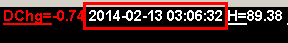
- DChg: This is the Daily Price Change. The Daily Price Change is based on the data provided by the Data or Trading service you are using Sierra Chart with. The Daily Price Change (DChg:) is calculated as the difference between the last trade price for the symbol and the prior day's closing/settlement price. If the prior day's closing/settlement price is incorrect or unavailable, then the Daily Price Change will be incorrect or be 0. You can see these values in Window >> Current Quote Window.
This value is in no way affected by the Session Times in the Global Symbol Settings or in the chart itself.
The underlying variables used in the calculation are accessible through ACSIL with the sc.SymbolData member. - DChg%: This is the Daily Price Change (DChg) calculated as a percentage.
- [description]: This displays the descriptive text for the symbol. This will be the name of a company in the case of a stock, or in the case of a futures contract the name of the futures contract. This description originates from the Global Symbol Settings but can change to a different description when connected to the data feed if the data feed provides a description for the symbol in the security definition data requested by Sierra Chart.
- DD(Link) (Data Delay): the Data Delay field calculates and displays the difference between the current time and the time of the Last Trade Price or the Last Bid / Ask Update time, whichever one is more recent. This is used to determine how much of a delay there is. If there is a delay of more than 1 minute "(delayed)" is displayed as well.
It is normal for this to show a delay at times of several seconds or even potentially of a minute or more during the time the market is open because there may not be trading always continuously occurring.
When the market is closed, the delay time that it shows will continue to get larger and larger as time goes by. However, once it exceeds 12 hours it no longer displays.
This field can be added through Global Settings >> Customize Chart Header.
Chart Header Text Colors
On the Chart Header the colors of the Net Change Up, Net Change Down and Alert Condition Highlight can be modified within the Graphics Settings. For more information, refer to Colors and Widths on the Graphics Settings webpage.
Additionally, any of the displayed Chart Header Text can be set to display as Reverse Color. When displayed in this manner, the text color is used as a highlight around the text itself and the text color is then changed to match the background color of the chart. In order to use Reverse Color, open the Global Settings >> Customize Chart Header page, select the desired header field in the Selected Header Fields box on the right, and then select the Reverse Color button. The Header Field will now show the text (RC) before the field name indicating that it will be displayed as Reverse Color.
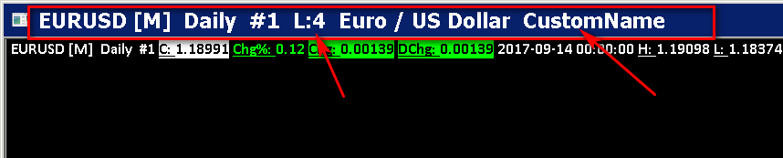
Chart Title Bar
Below is an example of the data fields displayed on the title bar of a chart. When a chart is detached or it is in a Restored state, the title bar is clearly visible.
When a chart is maximized and part of the main Sierra Chart window, the fields can be seen along the main window of Sierra Chart.
When a chart is set to a nonzero Link Number the link number is displayed on the title bar as is shown below.
A custom name can also be displayed on the title bar and this is set through Chart >> Chart Settings >> Display >> Title Bar Name .
The title bar of a chart can be hidden by removing the checkmark from Chart >> Show Title Bar. Make sure that menu item has a checkmark to see the title bar of a chart. It is enabled by default.
Chart Settings Indicators at Lower Right of Chart
At the lower right corner of the chart window, you will see various text indicators indicating certain Chart Settings. They are described below.
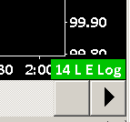
- [number]: This is the bar spacing in pixels.
- Log: This means the chart is using logarithmic scaling.
- L: This means Chart >> Lock Fill Space is enabled.
- E:This means that Chart >> Chart Settings >> Use Evening Session Times is enabled.
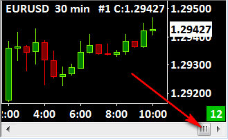
Color Indicating Whether Scrolled to the End of the Chart Or Not
The Chart Settings Indicator at the lower right corner of the chart is colored to indicate if the chart is scrolled to the end or not.
If it is colored in green (default color), then this is an indication that you are scrolled to the very end of the chart. This means that you will see real-time updating of the chart when connected to the data feed( File >> Connect to Data Feed). If it is colored in red (default color), then this is an indication that you are scrolled to a location other than at the end of the chart. To quickly jump to the end of the chart, press the End key on the keyboard.
The default green and red colors can be changed by changing the Scroll End Color and Scroll Not End Color color settings in the Graphics Settings window.
Symbol Indicators
After the symbol displayed on a chart or the chart's title bar, there are potential indicators that can be displayed: [M], [C], [CV], [CB], [CBV].
For information about [M], refer to Integration with Trading Services.
For information about [C], [CV], [CB], [CBV], refer to Text Indicator Description Table.
Bar Countdown Timer
To display the bar countdown timer select Global Settings >> Customize Chart Header on the menu. Add the field named Bar Countdown. It can be moved up or down as you require.
Once the Bar Countdown field is added, the countdown timer will be displayed on the Region Data Line at the top of the chart.
The remaining time only changes when there is trading activity. If there is no trading activity, the remaining time will not change. Markets do not trade second to second. They only trade when there is trading activity. Therefore, you cannot expect that the countdown timer will decrement every second because it will not always do this.
For a more advanced countdown timer use the Countdown Timer study which can be added through Analysis >> Studies. The countdown timer can be moved anywhere on the chart.
Chart Colors and Fonts
To adjust chart colors and the chart font, select Chart >> Graphics Settings on the menu.
Refer to the Graphics Settings documentation page for complete instructions.
To adjust the colors of studies, refer to the Chart Studies documentation page.
Viewing Charts in Multiple Monitors
There are 2 methods for viewing charts on multiple monitors.
One method is to detach a chart from the main Sierra Chart program window so it becomes a floating independent window. For instructions, refer to Detaching and Attaching Chart Windows.
The second method is to expand the main Sierra Chart window across multiple monitors. To do this, left click with your pointing device over the very top left of the main Sierra Chart window (this is where the globe is) and select Restore to put the main window in a resizable state.
Restore will be grayed out if the window is already in a resizable state.
By grabbing the title bar and edges of the main Sierra Chart window, adjust the position and size of the window to fully cover the monitors you want to view the charts on.
Open all the charts you want to view on your monitors, if they are not already open. Multiple charts can be opened at the same time in Sierra Chart.
Select Window >> Cascade so all of the charts are in a resizable state.
Adjust the position and size of your charts so they are positioned on the monitors where you want them.
With Sierra Chart spread across more than one monitor, you will be able to move charts anywhere within the Sierra Chart desktop. Select File >> Save on the menu to save the charts as a Chartbook so the chart window positions are saved.
Scrolling The Chart and Right Side Fill Space
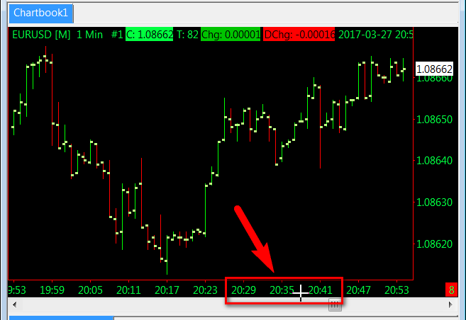
To view different sections of the loaded chart data, drag the box within the scroll bar at the bottom of the chart window (see image below).
This lets you scroll the chart horizontally along the time axis. Clicking once on either arrow of the scroll bar will scroll the chart by one graph column.
Left clicking in the scroll bar itself away from the scroll box will scroll the chart by just less than an entire window of graph columns. It is supported to scroll by more or less than one window of graph columns at a time. This is accomplished by changing the Global Settings >> General Settings >> GUI >> Scroll Multiplier. The default is 1.0. Use a smaller value to scroll by a smaller amount. Use a larger value to scroll by a larger amount.
When you left click in the scrollbar area away from the scroll box and the scroll box jumps either to the far left or far right, then there are two things you can do. Increase the number of days of data loaded in the chart through the Days to Load Chart Setting. Or, increase the chart Bar Spacing.
If it is not possible to scroll the chart either to the left or to the right, this could be caused by having all the available chart bars currently displayed in the window. When this occurs, there is nothing to scroll, therefore the scroll box will not be displayed and selecting the arrows of the scroll bar or clicking in the scroll bar will not change the positions of the bars. To overcome this there are two things that can be done. Increase the number of days of data loaded in the chart through the Days to Load Chart Setting. Or, increase the chart Bar Spacing until there is data that is outside of the view of the window.
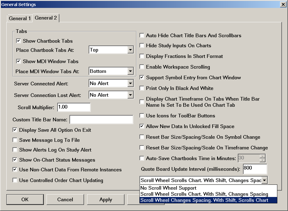
The Left and Right arrow keys on your keyboard or the scroll wheel on your pointing device can also be used to scroll the chart. The scroll wheel can perform 2 functions. It can scroll the chart, change the bar spacing or be set to do nothing. Refer to the Scroll Wheel Setting documentation in the General Settings page.
The Chart menu contains the Page Scroll Left and Page Scroll Right commands which can have keyboard shortcuts assigned to them to scroll the chart by an entire page of bars. For more information, refer to Customize Keyboard Shortcuts.
It is possible to adjust the Scroll Multiplier in Global Settings >> General Settings >> GUI to adjust the amount the chart is scrolled by when scrolling by one full page either with the scrollbar or by keyboard.
Hand Tool: Another method by which the chart can be scrolled horizontally is by using the Tools >> Hand tool. Refer to Hand Tool for complete documentation.
The Chart Settings Indicators at the lower right corner of the chart are colored to indicate if the chart is scrolled to the end or not.
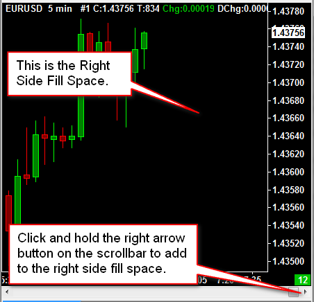
Right Side Fill Space
It is possible to scroll beyond the last bar loaded in the chart to create blank space on the right side of the chart. This is known as the Right Side Fill Space.
As new bars are added to the chart whether the chart is visible or not, the blank space will fill in. If Global Settings >> General Settings >> Charts >> Allow New Data In Unlocked Fill Space is set to No, then the blank space will not automatically fill in as new bars are added to the chart.
This fill space can also be locked (explained below).
The Right Side Fill Space is also useful for displaying study values for studies that support this, displaying study Subgraphs that forward project, and drawing Chart Drawings into the future using the Drawing Tools.
To scroll past the last bar loaded in the chart, do one of the following:
- Go to the chart and disable Chart >> Lock Fill Space if it is enabled.
- Press the right arrow button on the scrollbar at the bottom of the chart.
- Press and hold the Right Arrow key on your keyboard.
- Use the Tools >> Hand tool and drag the chart towards the left.
To remove the space on the right side of the chart, unlock the fill space if it is locked by removing the checkmark from Chart >> Lock Fill Space. Select Chart >> Go to End of Chart.
To reduce the amount of fill space on the right side of chart, press the left arrow button on the scrollbar at the bottom of the chart.
Locking the Right Side Fill Space
When the Chart >> Lock Fill Space option is enabled, the fill space on the right side of the chart will not change due to any new data or scrolling. This option can also be found in the Chart >> Chart Settings window.
When the fill space is unlocked, set it to the amount of space that you require. For instructions, refer to Right Side Fill Space. When that is done, lock it by enabling Chart >> Lock Fill Space.
The amount of fill space on the right side and locking of the fill space can also be programmatically controlled from chart studies. Therefore, if you are using a special study that controls the fill space, although highly unlikely, then you may not be able to set the fill space to the way you want and it will get reverted back to what the study sets. However, the study may have settings to adjust the amount of fill space on the right side of the chart.
When Lock Fill Space option is not enabled, you can modify the amount of fill space and the fill space will be filled in as new bars are added to the chart.
You can temporarily toggle this option by holding down the Ctrl key on the keyboard. So if the Lock Fill Space option is on, you can hold down the Ctrl key to modify the fill space, and if the Lock Fill Space option is off, you can hold down the Ctrl key to temporarily lock the fill space. You can easily enable or disable this option by using the Chart >> Lock Fill Space menu command.
Chart Drawings and Studies in the Right Side Fill Space
The right side fill space can be used for Chart Drawings and some Studies are capable of drawing into this space as well. This is also known as the forward projection area.
For example, the Time Line study can be set to be drawn in the forward projection area as well as where there are existing chart bars.
Chart Drawing tools can be drawn in the Forward Projection Area.
Removing Right Side Fill Space
Follow the instructions below to remove the fill space on the right side of the chart. However, based upon the amount of loaded data in the chart, there may still be space on the right side of the chart even after following the below instructions.
- Set Global Settings >> Graphics Settings >> Default Right Side Fill Space to 0. Press OK.
- Go to the chart and remove the checkmark from Chart >> Lock Fill Space.
- Select Chart >> Go to End of Chart .
- The right side fill space should now be removed and the last bar should be at the right side of the chart, assuming there is enough data loaded in the chart.
Study Subgraphs in Right Side Fill Space
A Study can be set to display its Subgraphs in the right side fill space of the chart by setting the Subgraph Draw Style to Line at Last Bar to Edge.
An Advanced Custom Study can also draw its Study Subgraphs into this right side fill space by using sc.Subgraph[].ExtendedArrayElementsToGraph.
Automatic Scrolling as New Bars are Added
When the last bar in the chart is visible, then as new bars are added to the chart during chart updating, the chart will automatically scroll and display those new bars.
To see if the chart is scrolled to the end and the last bar is visible in the chart, refer to the Scrolling the Chart section which describes the colored box at the lower right of the chart indicating whether the chart is scrolled to the end or not. By default this will be green when the last bar is visible.
To make sure you are scrolled to the end of the chart, select Chart >> Goto End of Chart .
There are two things to be conscious of which could inadvertently scroll the chart back from the end and prevent the last bar from being displayed. One of them is bumping the scroll wheel on your pointing device. This will scroll the chart if Scroll Wheel Scrolls Chart is selected in Global Settings >> General Settings >> GUI >> Scroll >> Scroll Wheel(List). You may want to set this to No Scroll Wheel Support.
The chart could be inadvertently scrolled back when using Tools >> Synchronize Charts.
Make sure to disable Chart >> Chart Settings >> Linking >> Chart Linking >> Scroll Position.
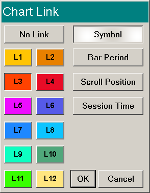
Chart Linking
Two or more charts and Trade DOMs within a Chartbook can be linked together.
Any of the following can be linked, so that when you make a change to any of these in one chart, the other charts will be updated to match.
- Symbol. Refer to Changing Symbol of Chart.
- Bar Period. Refer to Changing Chart Bars Period.
- Scroll Position (also adjusts the Fill Space to match)
- Session Times
- Studies
- Days to Load
- Bar Spacing
- Trade Window
- Vertical Scale
For complete details for these Chart Linking options, refer to the Chart Linking section on the Chart Settings page.
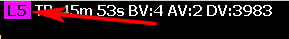
The Link Number is displayed on the title bar of the chart window and on the Region Data Line at the top of the chart. Example: L5 indicating Link number 5.
There are several methods to establish Chart Linking and they are documented below.
Chart Linking through Chart Settings
Chart Linking can be set through the Chart >> Chart Settings >> Linking window. Refer to the Chart Linking section on the Chart Settings page.
This is the method to use in the case of setting the Chart Linking settings for a Trade DOM.
Chart Linking through the Menu
Chart Linking can be set through the Chart >> Linking >> Number and Chart >> Linking >> Type menus for the active chart. It is necessary to set charts you want to link together to the same Link Number and then use the Type submenu to specify the type of linking.
Chart Linking through Control Bar Buttons
Control Bar buttons can be added to set the Link Number and the chart linking Type. To add these Control Bar buttons, follow these instructions:
- Select Global Settings >> Customize Control Bars >> Control Bar 1-8 on the menu.
- In the displayed window, in the Available Control Bar Commands, select the Chart Linking list and add the buttons that you require to the Control Bar.
- For more information, refer to Control Bars in the Global Settings Menu documentation.
- Once these buttons are on the Control Bar, when you press them, they will set the chart Link Number or the chart linking Type for the active chart.
Chart Linking through Link Number Field on Region Data Line
On the top Region Data Line of a chart it is possible to add a field that when clicked on with the left pointer button, a Chart Link window will display. To add this field, select Global Settings >> Customize Chart Header on the menu. In the list of the Available Header Fields, Add the Link Number field if it is not already added. Press OK.
Left click on the link number (L:#) on the Region Data Line at the top of a chart or click on NoLink if there is no link number set, to display the Chart Link window to set the Link Number and linking Type.
Changing the Chart Bars Timeframe
Changing the timeframe per chart bar is done by selecting Chart >> Chart Settings on the menu. For the documentation, refer to Chart Settings.
To quickly change the timeframe per chart bar, refer to the Changing the Period of the Chart Bars documentation page.
It is also supported to quickly change the timeframe per chart bar through standard and custom Control Bar buttons. The Control Bar is the series of buttons you see below the main window menu, this is the default location. For instructions to customize the Control Bar, refer to the Customize Control Bar section on the Global Settings Menu page.
Note: The Low and High for a bar in a chart is the Low and High for the entire time period of the bar. For example, a 10 minute Intraday bar that covers the time period 9:40 to 9:49, will show the Low and High for that time period.
Changing Bar Spacing
There are several ways to change spacing between the bars or columns in a chart. All of the available methods are explained below.
These methods also apply to TPO Profile Charts.
- Use the Up and Down arrow keys on your keyboard to increase or decrease the chart bar spacing by 1 graphics pixel at a time, respectively.
- Use the Page Up and Page Down keys on your keyboard to increase or decrease the chart bar spacing by a larger amount than 1 pixel, respectively.
- Use the
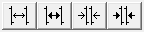 Control Bar buttons to increase and decrease bar spacing by 1 pixel or a larger amount. For more information about the Control Bars, refer to Customize Control Bars.
 - Use the scroll wheel on your pointing device. The setting which enables this is Global Settings >> General Settings >> GUI >> Scroll Wheel. Refer to the image below. Depending upon which option you select you may need to press and hold the Shift key on your keyboard before scrolling up or down to increase or decrease the bar spacing.
- Change the bar spacing in the chart by dragging the time scale at the bottom of the chart using your pointing device. To do this, left click and drag left or right along the time scale at the bottom of the chart. This will increase or decrease the spacing.
If after reducing the bar spacing zero (0) pixels, you still are not able to view the time range that you require, the next step is to increase the timeframe per chart bar. Refer to Changing Time Period of Chart Bars for instructions.
When changing the bar spacing in a chart, you are actually changing the number of pixels between all of the bars. There must be a consistent amount of spacing between bars. When there are a large number of bars currently displayed in the chart, and you increase or decrease the spacing between the chart bars, this will cause a significant change to the number of bars displayed. It is inherently impossible, to change the bar spacing in such a way to add or remove single or a small amount of chart bars, when there is already a large amount of bars displayed.
Zooming In and Out
Zooming In
Increasing Bar Spacing
Increasing bar spacing on a chart is a method by which you can expand horizontally or zoom-in an area on the chart.
To zoom-in to an area of the chart: Move the chart scrollbar at the bottom of the chart so that the last bar of the area you want to zoom-in to is at the end of the chart window. The reason this is important is because as the chart bar spacing is increased, the last displayed chart bar will continue to be in view and the bars on the left side of the chart will move off the chart towards the left. Increase the chart bar spacing to zoom-in.
Zoom In Tool
Another method by which you can zoom into an area on the chart is to use the Zoom In tool. Follow the instructions below to use this tool.
- Select Tools >> Zoom In on the menu. For other methods to select this tool, refer to Selecting Drawing Tools.
- Left click with your pointing device at the top left of the area you want to zoom in to, move your Pointer and left click again at the lower right of the area you want to zoom into.
- When you left click the second time, the chart will display the area from the top left to the lower right positions that you selected. This Zoom In Tool automatically places the main price graph of the chart to a User Defined Scale Range to display the upper and lower price boundaries selected. The prior Scale Range type is remembered.
- After you are done viewing the zoomed in area, select Tools >> Cancel Zoom In to restore to prior view and restore the Scale Range to the remembered setting.
The color of the Zoom In Tool is set by the value of the Chart Text setting on the Graphics Settings window.
Interactive Scale Range
Another method by which you can zoom into an area on the chart is to use the Interactive Scale Range feature and expand the scale vertically. This supports vertical zooming in.
Zooming Out
Decreasing bar spacing on a chart is a method by which you can compress horizontally or zoom-out an area on the chart. To zoom-out an area of the chart: Move the chart scrollbar at the bottom of the chart so that the last bar of the area you want to zoom-out is at the end of the chart window. Decrease the bar spacing.
Another method by which you can zoom-out an area on the chart is to use the Interactive Scale Range feature and compress the scale vertically. This supports vertical zooming out.
Selecting Charts or Navigating Among Charts
There are various methods to switch among the chart windows that are currently open within the active Chartbook. These methods are documented below.
- Using the MDI (multiple document interface) window tabs at the top or bottom of the main Sierra Chart window. If the MDI Window tabs are not enabled, then enable them in the Global Settings >> General Settings >> Windows tab.

For additional information, refer to General Settings >> Windows - Selecting a Chart or Spreadsheet window from the CW menu.
- Selecting a chart from the Window >> Windows and Chartbooks list.
- Arranging windows with the Tile commands on the Window menu and then clicking on a chart window with your Pointer.
- Using the Window >> Previous Chart (F4 Key) and Window >> Next Chart (F9 Key) commands.
- Detaching a chart and selecting it from the Windows taskbar.
- Within the main Sierra Chart window, select Window >> Restore. Once a window is in a restored state, its position can be adjusted by left clicking and dragging the title bar of the window. The size of the window can be adjusted by left clicking and dragging any edge of the window.
Working with Tabs
Double-clicking with your Pointer on an MDI tab, will maximize or restore the chart or Spreadsheet window associated with that tab.
Reordering the Chartbook Tabs
Chartbook tabs can be reordered through dragging and dropping.
To reorder the Chartbook tabs by dragging, simply click and drag a tab to its new location.
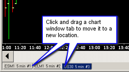
Reordering the Chart (MDI) Tabs
To reorder the Chart tabs through the Windows and Chartbooks window, select Window >> Windows and Chartbooks. Use the Move Up and Move Down to change the order of the windows, which affects the order of the tabs for the windows.
To reorder the Chart tabs by dragging, simply click and drag a tab to its new location. See image for further clarification.
The Spreadsheet windows, will always be on the right side of the MDI tabs bar. It is not possible to reorder those Spreadsheet tabs. It is not possible to move Chart window tabs between Spreadsheet window tabs or after them.
Changing Tab Names/Shortening Tab Names
To modify the name (description) you see on a chart window tab, select Chart >> Chart Settings >> Advanced Settings 2.
Specify a Title Bar Name. You can also set a shorter name in the Title Bar Name box to shorten the name (description) of the tab.
Enable the Use Title Bar Name As Tab Label option.
Tab Coloring
The Chart and Spreadsheet and Chartbook tab coloring is controlled by the following color settings in the Graphics Settings window.
- Chart Tab Color
- Chart Tab Text Color
- Chart Selected Tab Color
- Chart Selected Tab Border Color
- Chart Selected Tab Text Color
- Chartbook Selected Tab Color
- Chartbook Selected Tab Text Color
- Chartbook Tab Color
- Chartbook Tab Text Color
Additionally, it is also possible to color the Chart tabs according to the color assigned to a particular Chart Link number. For further details, refer to Color Chart Tabs with Chart Link Number Color.
Creating an Inset Chart
It is possible to create a chart that can be displayed in the corner of a monitor to enable quick viewing of a particular symbol. This can be viewed as an Inset chart, even though it actually will be separate from the main instance. Use the following instructions to create this kind of chart:
- Open the chart with the desired symbol as normal and have this chart as the active chart.
- Select Window >> Detach/Attach Window to detach this chart from the main Sierra Chart program.
- Resize the detached chart to the desired size and place it in the desired placement on the monitor.
- On this detached chart select Window >> Always on Top. This will keep this detached window in view when working with other charts within the same Chartbook.
The following instructions are for additional changes that can be made to the Inset window based on personal display preferences:
- To keep this inset window visible even when changing between Chartbooks: on the Inset window select Window >> Window Always Visible.
- To remove the display of the Title Bar: on the Inset window select Chart >> Show Title Bar to remove the check next to this feature.
- To remove the display of the scrollbar: on the Inset window select Chart >> Show Scrollbar to remove the check next to this feature.
- To remove the display of the menu bar: on the Inset window select Chart >> Show Menu to remove the check next to this feature. To access the menu when it is not displayed, refer to the documentation for Show Menu.
Chart Data Files
For detailed information about chart data files, refer to the Chart Data Files documentation page.
Using Chart Tools
Sierra Chart provides a large set of professional drawing tools to draw various types of objects and lines on charts to perform analysis. To use a chart drawing tool, select Tools on the menu and select a tool from the menu. Refer to the Chart Drawing Tools documentation page for complete instructions for all of the available Tools and to learn about configuring tools.
Displaying Current Price Line
To display a line on a chart, at the price level of the current price, that displays across the entire visible chart, use the Current Price Line study.
Overlaying Multiple Symbols in a Single Chart Window
Sierra Chart supports overlaying graphs for multiple symbols, within a single chart.
There are two ways this can be done. They are both documented below.
The first method is by using the Add Additional Symbol study and requires no additional charts. To add this study to the chart, refer to For further details, refer to Adding/Modifying Studies.
The second method is to use the Overlay (Bar) study and is documented below.
- Open a chart for each of the symbols that you want to view. Open the charts through File >> Find Symbol.
- Go to one of the charts where you want to contain graphs for all of the symbols.
- Select Analysis >> Studies on the menu.
- Add either the Overlay (Bar) or the Overlay (Single Line) study to the chart. For further details, refer to Adding/Modifying Studies.
- Open the Study Settings window for the added study by selecting the study in the Studies to Graph list and pressing the Settings button on the Chart Studies window.
- Select the Settings and Inputs tab, set the Chart Number to Overlay input, to the particular chart that you want to overlay the main price graph of, on the destination chart.
- Set the Chart Region setting to the particular Chart Region where you want to the overlay graph to be displayed.
- Select the Subgraphs tab and change the Graph Draw Type setting and the Subgraph related settings to what you require.
- Repeat the prior five steps for each symbol that you want to overlay a graph of on the chart.
Resolving Chart Issues
If you have data errors in a chart or a chart is not updating when it should be, then refer to the Help Topics page.
Charts Unexpectedly Scroll Back and Change Fill Space Amount
When using the Chart Values tool on a chart, you then switch to another chart and you find that the chart you switched to has scrolled back from the end and the fill space on the right side of the chart also may have changed, then this is the result of using the Tools >> Synchronize Charts feature.
You will need to uncheck the Tools >> Synchronize Charts option to prevent this.
Another potential reason why a chart could unexpectedly scroll, is if you have set the Scroll Wheel Setting to scroll the chart. The scrolling could possibly happen if your scroll wheel is inadvertently giving signals.
A chart can also scroll back from the end of the chart when using Chart Linking and linking the Scroll Position. When any other chart is scrolled back from the end that is also using the same Link Number and the other chart which has unexpectedly scrolled back, has Linking >> Scroll Position enabled in the Chart >> Chart Settings, then it also will be scrolled back.
To go back to the end of the chart, go to the chart and make sure it is active and select Chart >> Go to End of Chart.
Zooming into Bar by Decreasing Time Period per Bar
Follow the instructions below to zoom into a bar by decreasing the time period / timeframe per bar in the chart.
- Scroll the chart to 1 bar after the last bar you want to zoom into, by using the scroll bar at the bottom of the chart.
- Decrease the timeframe per bar in the chart to 1 Minute or whatever detail that you require. Refer to Changing Chart Bars Period.
- The bars displayed, will be bars which are contained in the bar that you wanted to zoom in to.
- Increase or decrease the Bar Spacing as required.
Hiding Main Price Graph
Follow the instructions below to hide the main price graph.
- Select Chart >> Graph Draw Types >> Blank. This can also be set through Chart >> Chart Settings >> Graph Draw Type.
- Reduce the height of Chart Region 1 to a minimum by using the Adjust Regions function. Assuming there are other Chart Regions being used which contain studies. For instructions, refer to Chart Window and Regions.
- Select Chart >> Chart Settings >> Advanced Settings 2. Set the Region Data Lines >> Region Number >> Region 1 >> State to Hidden .
- Press OK.
Out of Memory Condition
A message like the following:
Means that the memory available to Sierra Chart from the operating system, has run out. When this condition occurs the chart will go completely blank. A similar error can occur in relation to the chart itself and not to a particular study.
The first step is to reduce the amount of memory used by Sierra Chart if possible. The next step is to run the 64-bit version of Sierra Chart.
Go to each of your charts in each open Chartbook and select Chart >> Chart Settings. Set the Days to Load setting to 10 days or less. This should at least bring the problem under control for the time being for you. You may have to set Days to Load to an even smaller value if there are a large number of bars per day in the chart.
Generally the cause of this condition is loading too many days of data in a chart and having a very short timeframe per bar.
Another setting to check is Global Settings >> Data/Trade Service Settings >> Number of Stored Time and Sales Records. This should not be higher than 10000 to 15000 usually. Otherwise, using too high of a setting will use a lot of memory.
Another good solution to the problem is to reduce the number of charts you have open in an instance of Sierra Chart and use additional instances of Sierra Chart through the File >> New Instance feature. Refer to the Using DTC Server for Data and Trading in Another Sierra Chart Instance page for instructions.
If a chart is completely blank due to an out of memory condition and more memory is later available, you can try reloading the chart with Chart >> Reload and Recalculate.
Finally, computers these days running the Windows operating system really should have 16 GB of memory minimum. This is what we recommend.
Resolving Differences of Chart Bars Between Charts
Follow the instructions below to resolve differences between chart bars on two different charts.
These charts can be within the same installation of Sierra Chart or different installations of Sierra Chart.
If this issue involves differences with studies between charts, then refer to Resolving Study Differences instead.
- One way to ensure consistency between chart bars between two different charts of the same symbol in the same installation of Sierra Chart, is to duplicate one of the charts. After duplicating one of the charts, reload the data in the original chart with Chart >> Reload and Recalculate. Both the original chart and the duplicated chart will now be identical.
At least in most cases. But there could be a difference if basic symbol settings like the Tick Size has changed in the duplicated chart. Since it will be set back to its default value in the duplicated chart.
The information below has more detailed information. - Ensure there is complete and consistent data for the charts.
If you are comparing charts between different instances of Sierra Chart, check the Intraday Data Storage Time Unit setting. It needs to be set the same between instances.
Re-download the data by going to the chart and selecting Edit >> Delete All Data and Download. If the charts are within the same instance of Sierra Chart, this only needs to be done for one of the charts.
If the charts are in different instances of Sierra Chart, then this procedure needs to be followed for each instance.
If you are using sub instances (File >> New Instance), perform this procedure first in the main/server instance of Sierra Chart and then in the sub instance. - The next step in order to make sure that you remove any data that has been loaded in the chart earlier than the Days to Load setting in Chart >> Chart Settings, which occurs over time, is to select Chart >> Reload and Recalculate for each of the charts being compared.
This step will make a difference if the first Date-Time in the chart is different between the two charts you are comparing. You can see what this is by going to each chart and selecting Chart >> Goto Beginning of Chart and looking at the Date-Time of the first bar. - Go to one of the charts you are comparing, and examine all of the settings in Chart >> Chart Settings and compare them to the Chart Settings to the other chart being compared to see where the difference is with these settings.
The settings on the following tabs can change chart bars: Symbol, Data Limiting, Bar Period, Session Times, Chart Data
Also the following settings will cause differences and need to be the same between the charts: - In the two charts being compared which have different chart bars compared to each other, select Chart >> Go to Beginning of Chart and ensure the Date-Time of the first bar in the chart, matches between the charts you are comparing. This may not always be necessary but could be necessary.
If they do not match between the charts being compared, then ensure the Chart >> Chart Settings >> Use Number of Days to Load >> Days to Load matches between the charts and reload each chart by going to the chart and selecting Chart >> Reload and Recalculate.
Select Chart >> Go to End of Chart to go to the end of the chart. - The difference could also be with the configuration of studies in Analysis >> Studies. Check the Inputs settings for each study and make sure they match between the charts.
- Make sure the Use Monday as Start of Week instead of Sunday setting is set the same between each Sierra Chart installation when comparing charts between installations. After changing this setting you will need to reload the charts with Chart >> Reload and Recalculate.
- If the charts are within different instances of Sierra Chart, then follow the Sharing a Chart with Another User procedure to save that single chart as a Chartbook and share it with the other instance of Sierra Chart and open that Chartbook. The charts should be identical because the settings now are guaranteed to be the same.
If there is a difference, then this would mean there is a difference in the underlying data between the charts if the charts are within different instances.
Error Creating Chart Windows and Trade Windows
If you receive messages like the following in the Window >> Message Log when opening a Chartbook or creating a new chart or opening a Trade Window, then this means you are running out of resources in your Windows operating system for the creation of chart windows.
The first solution to this problem is to enable Destroy Chart Windows When Hidden and then close all of the Chartbooks with File >> Close All Chartbooks and reopen them.
The next solution is going to be to use sub instances of Sierra Chart to distribute your Chartbooks among multiple instances of Sierra Chart.
Sierra Chart places no restrictions on the number of Chart or Trade windows you can have and are open simultaneously. It is the operating system running into a problem if you encounter these errors. We must make this clear, this is a Windows operating system limitation and problem.
Stopping Chart Data Loading/Calculations
If you look at the chart, that is loading you can left click where it says "Click to cancel" to stop the loading process.
If that does not work and the entire program is in a frozen state, the frozen state must be relating to study calculations being performed, which can be due to a large number of bars in the chart which can be the case, if a very short timeframe has been set for each bar. In this Case you need to wait until the study calculations complete. For more information, refer to High CPU Usage/Long Time to Load Chart Data.
*Last modified Friday, 10th January, 2025.