Lines/Rays or Other Chart Drawings Move After Drawing Them
- Introduction
- Right Side Fill Space and Variable Chart Bar Timeframes
- Is There a Solution?
- Rays and Other types of Extending Drawings Move
- Logarithmic Scaling and Rays
- Logarithmic Scale and Parallel Lines
- How Chart Drawings Are Mapped Between Bars with Different Starting Date-Times
- Chart Drawings Are Misaligned After Changing the Period / Timeframe Per Bar
- Chart Drawings During a Chart Replay
Introduction
There are reasons why a Chart Drawing that you have drawn with a Drawing Tool may move after you have drawn it. The drawing could move during chart updating, after a download or re-download of historical chart data, when you change the period/timeframe of the chart bars, or when changing the scale of the chart. The various kinds of issues you may see and reasons for the behavior are provided on this page.
If support has referred you to this Help topic, review the information here carefully and please do not ask support about this further.
The reasons why you see this type of behavior are solely based on very definite mathematical and technical facts, that are not changeable, and the nature of what you are doing. None of this is any type of problem/bug in Sierra Chart.
Furthermore, it is not possible for us to resolve something which is mathematically or technically impossible or illogical to resolve. The solution is to change your procedures with working with Chart Drawings and altering Chart Drawings in such a way as to not encounter the problem to begin with. So you have the ability to solve the problem yourself.
Right Side Fill Space and Variable Chart Bar Timeframes
A variable timeframe chart bar is one that is based upon Volume, Number of Trades, Range, Reversal, Renko, Delta Volume, Price Changes.
When scrolling past the right side of the chart you will create what is known as the Right Side Fill Space. For more information, refer to Right Side Fill Space. It is possible to draw Chart Drawings, like a Line or Ray, into this fill space.
The Date-Times of the columns in the chart Right Side Fill Space are based upon the timestamps of the prior bars in the chart.
If you are using chart bars based upon Volume, Number of Trades, Range, Reversal, Renko, Delta Volume, Price Changes, then these Date-Times in the Right Side Fill Space are estimated and will change as new bars are added to the chart, possibly after a historical data reload from the data file, after historical data is downloaded, and when you change the Bar Period/Timeframe setting of the chart bars.
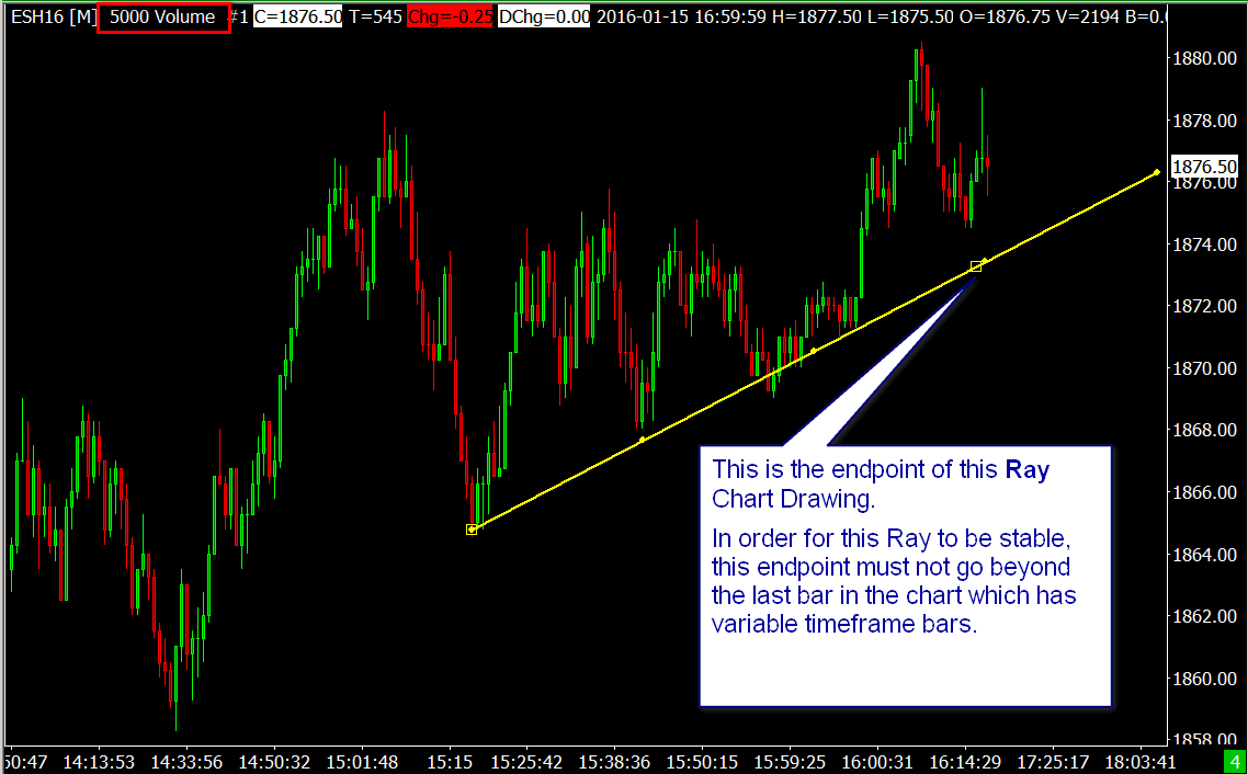
If you draw a Chart Drawing with one or more endpoints on a column in this Right Side Fill Space, then that Chart Drawing can move as the Date-Times of the columns in the fill space change. An endpoint are any of the clicked at points in the chart when drawing a Chart Drawing. For example, if you are drawing a Ray and the second point you set is in the Right Side Fill Space, then it has an endpoint in this fill space.
The simple solution to this kind of problem is to avoid drawing a Line/Ray or other type of Chart Drawing that has an endpoint in the Fill Space on the right side of the chart.
The best solution to this in the case of when you just want a simple Line, is to use the Ray tool and do not make the second point that you set with the second left click, go past the last visible bar and into the Right Side Fill Space.
Since a Ray extends, it will extend into the fill space anyway. There are several types of extending drawing tools. They are as follows: Ray, Parallel Rays, Extended Line, Horizontal Ray, Price Retracement/Projection/Expansion (when using extended levels).
Later on when the extensions are no longer relevant, you can right-click on the extending line or lines and select Cut Drawing Here .
If you are drawing a horizontal line and you are using the Line/Ray Tool, then we recommend using the Horizontal Line or Horizontal Ray tools instead.
This issue is another reason why chart bars with a variable timeframe are unstable in their nature.
Is There a Solution?
Sometimes we are asked about whether there is a solution to what is described primarily in the Right Side Fill Space and Variable Chart Bar Timeframes section.
The short answer is there is no technical solution to this other than the one described and we will explain the reason why.
The horizontal axis on a chart is a time-based axis. This is a basic fact which does not change. The timeframe of each column in the chart is either variable or fixed. The problem comes about when each of the chart columns have a variable amount of time.
When you draw a Chart Drawing that ends within the right side fill space in a chart with variable timeframe bars, then you are drawing that Chart Drawing into a point of time which is really unknown and indefinite. So you need to understand, at this point, you have created the problem which does not have a definite solution other than the one described.
If Sierra Chart were to consider that the column you drew into, as the number of chart columns after the last bar in the chart (offset from last bar), and as chart bars are added to the chart, we were to step down that offset, then may seem to solve the problem but it creates another equal problem explained below.
When the timeframe of the chart bars are changed, the time span of those empty columns after the last bar in the chart change. So if you drew 10 columns after the last bar in the chart and then you change the timeframe of the bars and the Chart Drawing ends 10 bars after the last bar in the chart, then the Chart Drawing you drew will move because the amount of time that those 10 columns represents is now different. So therefore it is necessary to do an adjustment and best fit the Chart Drawing to the correct Date-Time. This last way is how Sierra Chart currently works.
The only solution to the problem is when drawing a Chart Drawing on variable timeframe chart bars that ends in the fill space, which is an unstable area timewise, that the actual ending point of the Chart Drawing is at a known time which would be the last bar in the chart or earlier, and then extend the Chart Drawing after that known point in time.
You can accomplish this yourself simply by using a Chart Drawing type that extends and making sure the last point is set at or before the last actual bar in the chart. This has been what is already described in Right Side Fill Space and Variable Chart Bar Timeframes.
Now could Sierra Chart prevent the end point of a Chart Drawing from going beyond the last bar in the chart when using variable timeframe chart bars? Yes, but if we were to do this it is going to create a limitation which would certainly be disliked by many users and you already have the ability to do it yourself anyway and understand exactly what is going on. Also, it would not make any sense for Sierra Chart to do this when drawing a Chart Drawing in the fill space when the timeframe of the chart bars are fixed, like 5 minutes per bar or 1 Day per bar.
Rays and Other types of Extending Drawings Move
This section is about Ray Chart Drawings and other types of extending Chart Drawings. Ray drawings are drawn with the Tools >>Ray drawing tool.
When Ray drawings and other types of extending drawings, extend to the right, the price level the Ray is at on the right side of the chart can change as new data is added or when the timeframe per bar changes. Therefore, the Ray will not always intersect the same chart values on the right side. The reason for this is the Ray endpoint value can ascend or descend because the line is sloping and as it extends, the value that it intersects changes.
The above also applies to when a Chart Drawing which is copied to another chart since in most cases the other chart will have a different timeframe per bar and therefore a different number of bars. This is especially true with variable timeframe bars because with a sloping line, the level where it will intersect at a particular point in time, is going to be different compared to fixed time bars. This is all basic geometry.
Values in a chart and Chart Drawings drawn in a chart use floating-point values. Computer monitors or other display type devices use an integer coordinate system. Each pixel that you see on a monitor is equivalent to a particular integer coordinate. When mapping between floating-point coordinates and integer coordinates, there is some imprecision and some misalignment that does occur. The effect of this will be reduced by using a 4K (high-resolution) monitor.
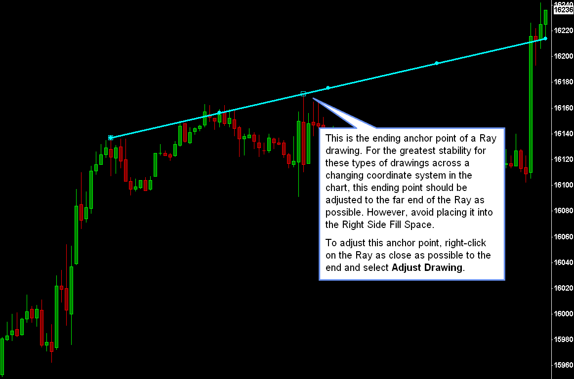
This is a reason why you may see a Ray and other extending drawings move at the end of those lines, as you adjust the scaling of a chart, like when expanding and compressing the vertical scale or changing the bar spacing in the chart.
The solution to this, is to set the ending point of a Ray drawing as close as possible to the endpoint of the Ray drawing. By doing this, this will make it more stable. Although avoid placing it into the Right Side Fill Space in the chart which will cause other stability issues for a different reason.
To adjust the endpoint of the Ray drawing, right-click on the Ray drawing with your Pointer device, towards the end of the drawing and select Adjust Drawing. Adjust the endpoint as far towards the end as possible and left click with the Pointer to set the endpoint. Refer to the image below for further detail.
This section explains some background on how a Ray drawing extends from the ending point you have drawn, towards the edge of the chart, whatever direction that may be in. The beginning and ending horizontal coordinates (exist as bar index values) and vertical coordinates (exist as floating-point chart region values, usually prices) are used in a standard line equation formula to adjust the line to the edge of the chart. Once these calculations are done, these results are mapped into the horizontal and vertical integer coordinate system of the display device. This method provides the highest degree of accuracy, but on the final step when converting to the integer coordinates system, this is where a Chart Drawing can shift.
This is less of a problem on 4K monitors. Therefore, if you are having a problem with Ray and other extending type drawings moving, use a 4K monitor.
There is no such thing as a fractional pixel. Sierra Chart has to draw line to the nearest matching pixel, and that can cause a slight shift of the line.
Logarithmic Scaling and Rays
When a Ray is extended, it is done so using a linear equation using the actual price values. The value of the line at the end of the chart should be accurate to the original slope of the line. However, values in the middle may not visually match up because the chart is on a Logarithmic (non-linear) scale.
If Sierra Chart were to draw a line that would match up with all the values in-between, the line would have to be drawn as a curve. And because Sierra Chart does not do this, lines can be a bit confusing on charts using the Logarithmic scale.
In addition, since the slope of the ray is being kept constant when the line is extended, it may not match up with the anchor point from which the extension occurred, depending on the size of the range of prices that are displayed. For example, when drawing a ray, the initial line is defined by Anchor Points A and B, and the line is automatically extended from point B outward, therefore the line is no longer constrained to go through Point B, but rather is drawn from Point A to the edge keeping the same slope as initially drawn.
Logarithmic Scale and Parallel Lines
This section is about parallel lines drawn on a chart with a Logarithmic scale. This is somewhat of a different subject than the rest of this help topic, but it is somewhat related.
When using the Parallel Lines or Parallel Rays drawing tools on a chart with a Logarithmic scale, the lines will not visually appear to be parallel if they are sloping.
This is especially true if there is a wide range of prices displayed in the chart.
The definition of parallel lines is that at any given chart bar, the distance between the two parallel lines will be the same. So this definition is being met. However, because the chart uses a Logarithmic scale and the lines are sloping, they visually appear to have a different distance between them at different chart bars.
If you want lines to visually appear to be parallel on a Logarithmic scale, then you need to manually draw them and not use the Parallel Lines/Rays drawing tools. However, you need to ask yourself whether what you are doing is logical to begin with.
In addition, since the slope of the lines is being kept constant when the line is extended, it may not match up with the anchor point from which the extension occurred, depending on the size of the range of prices that are displayed.
How Chart Drawings Are Mapped Between Bars with Different Starting Date-Times
When you change the period/timeframe of the chart bars or you are copying Chart Drawings from one chart to another using the Copy Chart Drawings from Chart #'s feature to do this, Sierra Chart has to find the corresponding bars among the new period/timeframe bars or the destination chart bars in the other chart, for the endpoints of Chart Drawings.
The Date-Time of the bars that the Chart Drawing endpoints were originally drawn to, are matched to the bars that contain those same Date-Times.
It is for this reason that when you are drawing a Line or other Chart Drawing to the High or Low of a higher timeframe bar and you then change the chart bars to a lower timeframe per bar (For example: changing from 60 minutes to 5 minutes per bar), the Line will most likely not have its endpoints match to the same bar that has made the particular High or Low. The vertical axis price coordinates will match, but the horizontal axis Date-Time coordinates most likely will not. The solution to this is to draw a Line or other Chart Drawing on a lower timeframe per bar chart to the exact Date-Time where the High or Low occurred.
You can instruct Sierra Chart to perform a nearest match instead of a containing match by selecting Global Settings >> Tool Settings >> General and enable the When Mapping Chart Drawings to Bars, Use Nearest Match Instead of Containing Match option.
For additional help with this, refer to the Chart Drawings Are Misaligned After Changing the Period / Timeframe Per Bar section.
Chart Drawings Are Misaligned After Changing the Period / Timeframe Per Bar
There are various reasons why a Chart Drawing may be misaligned after you change the timeframe of the chart bars. For example, going from Daily bars to 60 minute bars.
The information given in this section also applies when copying Chart Drawings from one chart to another chart that has a different timeframe per bar or has a different starting Date-Time in the chart, by using the Chart >> Chart Settings >> Chart Drawings >> Copy Chart Drawings from Chart Numbers feature.
- In most cases there is not an exact match of the starting Date-Time of the bars that the Chart Drawing anchor points use, between the different timeframes of the bars you are changing between. You can use an alternative matching method as explained in the How Chart Drawings Are Mapped Between Bars with Different Starting Date-Times section on this page, as a possible solution. So this is going to cause the Chart Drawings to be misaligned relative to the chart bars when copied to another chart.
In the case of a Ray drawing, the portion of the Ray that extends after the second point is going to intersect different vertical axis coordinates because of this. Also, the very fact there are different number of bars between the different time frames also will change the vertical axis coordinates the line intersects after the second point.
In this case regarding Ray drawings, the solution is that the Ray drawing on the source chart needs to have its beginning and ending anchor points as set when drawing the Ray, to cover the same or wider Date-Time range that the Ray drawing is copied to on the destination chart where there is a misalignment. - Another possible solution is to consistently use your Chart Drawings on either Historical or Intraday charts only. For example, set the Chart Data Type in Chart >> Chart Settings to Intraday Chart Only, so that no matter what time frame per bar that you use, only the more detailed Intraday data will be used.
This might minimize misalignment issues. When using Intraday data charts, you can create Daily bars by setting Chart >> Chart Settings >> Days-Minutes-Seconds to 1-0-0. If the chart was previously a Historical Daily data chart, you will need to redraw the Chart Drawings on the more detailed Intraday data for the greatest accuracy. - Values in a chart are floating-point values. Computer monitors or other display type devices use an integer coordinate system. Each pixel that you see on a monitor is equivalent to a particular integer coordinate. When mapping between floating-point coordinates and integer coordinates, there is some imprecision and some misalignment that can and will occur. The effect of this will be reduced by using a 4K (high-resolution) monitor.
- If you have changed the timeframe of the chart bars or you are copying Chart Drawings from one chart to another, then also check that the first Date-Time in the chart where the drawing appears is early enough to actually include the Date-Time of the original leftmost point of the Chart Drawing. So you may need to increase the Days to Load setting in Chart >> Chart Settings.
- Another very important item which can cause misalignment of Chart Drawings when changing the timeframe of the chart bars or copying Chart Drawings from one chart to another, is if the ending anchor point of the Chart Drawing is is in the Right Side Fill Space in either the source or the destination chart.
Make sure it is on an actual visible bar instead of in the fill space. Refer to the Adjust Chart Drawing documentation to adjust the ending anchor point of a Chart Drawing on the source chart.
This is definitely a problem when the chart bars are not based upon a fixed amount of time and instead are variable. - When copying a Chart Drawing between different time frames, it is best to draw the Chart Drawing on the shorter timeframe chart and actually make sure the anchor points (where you left click to set the points) of the Chart Drawing are set exactly where you want them to be on that timeframe. This ensures they will remain stable at those particular locations.
Based upon the above explanations, there is not necessarily an exact mapping of the Date-Time and Value anchor points of the Chart Drawing between different time frames per bar.
This is simply because the bars are of a different resolution and there is insufficient and consistent detail available. This imprecision exists due to mathematical and physical display monitor limitations which cannot be overcome.
Additionally, in the case of a Chart Drawing that extends, the reason for misalignment is simply due to the fact that the coordinate system is different because there are a different number of chart bars over the span between the anchor points of the Chart Drawing.
Chart Drawings During a Chart Replay
During a Chart Replay, it is necessary that that Date-Time begin and end anchor points for the Chart Drawing are currently loaded in the chart. Otherwise, the chart drawing anchor points will map to the nearest Date-Time values in the current chart, and affect the display of the Chart Drawing. In this case the Chart Drawing will not appear correctly and will gradually change as the chart replays.
*Last modified Thursday, 18th May, 2023.